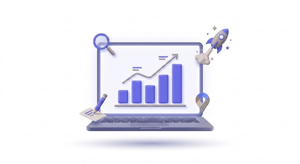
What is Infographic?
An infographic is a visual representation of data, information, or knowledge designed to present complex topics quickly and clearly — making it highly shareable and effective for earning backlinks.
On This Page
What is an Infographic?
An infographic is a visual content format that combines data, text, and design to explain a topic in a scannable, easy-to-understand layout.
Infographics work because the brain processes visual information 60,000x faster than text. A well-designed infographic can communicate what would take 2,000 words of text in a single scrollable image. They’re used across content marketing, social media, presentations, and PR — anywhere you need to make complex information accessible.
According to Venngage, infographics are shared 3x more than any other content type on social media. They’re also one of the best formats for earning backlinks — publishers embed them and link back to the source.
Why Do Infographics Matter?
They turn data into attention. And attention into links.
- Link building asset — Infographics earn 178% more backlinks than standard blog posts, according to BuzzSumo research. Other sites embed your infographic and credit your page
- Social sharing — Visual content gets shared more than text. Infographics on Pinterest, LinkedIn, and X consistently outperform text-only posts
- Audience education — Complex processes, comparisons, and statistics become immediately understandable when visualized
- Content repurposing — One infographic can be broken into 5-10 social media posts, each featuring a different section or data point
For SEO teams, infographics are one of the most reliable formats for earning organic links.
How Infographics Work
Data Collection
Start with compelling data — industry stats, survey results, process steps, or comparison points. The data is the foundation. Without interesting data, no amount of design saves an infographic.
Design and Layout
Use tools like Canva, Venngage, or Piktochart — or hire a designer. Follow a logical flow: top to bottom, with clear sections, consistent colors, and minimal text. White space matters. Don’t cram everything into one image.
Distribution
Publish the infographic on your blog with supporting text (for SEO). Share on social media. Pitch it to industry publications for embeds. Submit to infographic directories. Each placement is a potential backlink.
Infographic Examples
An HR software company creates an infographic titled “The True Cost of a Bad Hire.” It visualizes data from 5 studies into one clean graphic. The image gets embedded on 40+ HR blogs, earning backlinks that push their site’s domain authority up 8 points.
A local marketing agency designs an infographic comparing social media platforms by audience demographics. They share sections as individual LinkedIn carousel posts across 2 weeks. Total reach: 120,000.
Common Mistakes to Avoid
Most businesses make the same handful of errors. Recognizing them saves months of wasted effort.
Chasing tactics without strategy. Jumping on every new channel or trend without a clear plan. TikTok one month, LinkedIn the next, podcasts after that — none done well enough to produce results. Pick your channels based on where your audience actually spends time, not what’s trending on marketing Twitter.
Measuring the wrong things. Tracking impressions and likes instead of conversion rate and revenue. Vanity metrics feel good in reports. They don’t pay the bills.
Ignoring existing customers. Most marketing teams focus 90% of their energy on acquisition and 10% on retention. The math says that’s backwards — acquiring a new customer costs 5-7x more than keeping one.
Key Metrics to Track
| Metric | What It Measures | Good Benchmark |
|---|---|---|
| Customer Acquisition Cost (CAC) | Total cost to acquire one customer | Varies by industry — lower is better |
| Customer Lifetime Value (CLV) | Revenue from a customer over time | Should be 3x+ your CAC |
| Conversion Rate | % of visitors who take desired action | 2-5% for websites, 15-25% for email |
| Return on Investment (ROI) | Revenue generated vs money spent | 5:1 is a common benchmark |
| Click-Through Rate (CTR) | % of people who click after seeing | 2-5% for ads, 3-10% for email |
Quick Comparison
| Aspect | Basic Approach | Advanced Approach |
|---|---|---|
| Strategy | Ad hoc, reactive | Planned, data-driven |
| Measurement | Vanity metrics (likes, views) | Business metrics (revenue, CAC, LTV) |
| Tools | Spreadsheets, manual tracking | Marketing automation, CRM integration |
| Timeline | Short-term campaigns | Long-term compounding strategy |
| Team | One person does everything | Specialized roles or automated workflows |
Real-World Impact
The difference between businesses that apply infographic and those that don’t shows up in hard numbers. Companies with a structured approach to this see 2-3x better results within the first year compared to those who wing it.
Consider two competing businesses in the same industry. One invests time in understanding and implementing infographic properly — tracking performance through marketing strategy, adjusting based on data, and iterating monthly. The other takes a “set it and forget it” approach. After 12 months, the gap between them isn’t small. It’s often the difference between page 1 and page 4. Between a full pipeline and a dry one.
The compounding nature of marketing funnel means early investment pays disproportionate dividends. A 10% improvement this month doesn’t just help this month — it lifts every month that follows.
Step-by-Step Implementation
Getting started doesn’t require a massive overhaul. Follow this sequence:
Step 1: Audit your current state. Before changing anything, document where you stand. What’s working? What’s clearly broken? What metrics are you currently tracking (if any)? This baseline matters — you can’t measure improvement without it.
Step 2: Identify quick wins. Look for the lowest-effort, highest-impact changes. These are usually things that are misconfigured, missing, or simply not being done at all. Fix these first. They build momentum.
Step 3: Build a 90-day plan. Map out the larger improvements across three months. Prioritize by impact, not by what seems most interesting. The boring foundational work often produces the biggest results.
Step 4: Execute consistently. This is where most businesses fail. Not in planning — in execution. Set a weekly cadence. Block the time. Do the work. Infographic rewards consistency more than brilliance.
Step 5: Measure and adjust. Review your metrics monthly. What moved? What didn’t? Double down on what works. Cut what doesn’t. This review loop is what separates professionals from amateurs.
Frequently Asked Questions
How much does an infographic cost to create?
DIY tools like Canva are free. Freelance designers charge $200-$1,000 per infographic. Agencies charge $1,000-$5,000 for research, copy, and design. The ROI comes from backlinks and social shares.
What makes a good infographic?
Strong data, clean design, logical flow, and a focused topic. One idea per infographic. If you’re trying to cover everything, the infographic becomes cluttered and loses its visual advantage.
Do infographics help with SEO?
Yes — primarily through backlinks. The infographic itself (an image) doesn’t rank in Google text search, but the page hosting it does. Earn enough links to that page, and it ranks for the target keyword.
Want to build the organic content foundation that infographics link to? theStacc publishes 30 SEO-optimized articles to your site every month — automatically. Start for $1 →
Sources
- BuzzSumo: Content Trends Report
- Venngage: Infographic Statistics
- HubSpot: How to Create Infographics
Related Terms
Backlinks are links from other websites that point to a page on your site. Google treats them as votes of confidence — the more high-quality backlinks a page earns, the more likely it is to rank higher in search results.
Content MarketingContent marketing is a strategy focused on creating and distributing valuable, relevant content to attract and retain a target audience. Instead of directly pitching products, it builds trust and authority that drives profitable customer action over time.
Content RepurposingContent repurposing is the practice of transforming existing content into new formats — like turning a blog post into a video, infographic, or social media carousel — to reach different audiences across multiple channels.
Link BuildingLink building is the practice of getting other websites to link back to your site. These backlinks act as votes of confidence that tell Google your content is trustworthy and worth ranking higher in search results.
Virality RateVirality rate measures how frequently your content is shared relative to the number of people who see it — expressed as shares divided by impressions, showing how likely your content is to spread beyond your existing audience.