Real event-planner websites reviewed against a published, events-specific scorecard — portfolio depth, service tiers, date-qualification, trust signals, and a funnel you can actually measure.
A couple starts scrolling planner portfolios at 11 p.m., seven tabs open, comparing five sites in one sitting before falling asleep mid-scroll. A corporate meeting planner does the same thing at her desk between calls, except she is checking insurance and capacity, not color palettes. Both close the tab in under a minute if the site does not answer their specific question.
That is the real test behind any event planner website design example worth studying: not whether it looks polished, but whether it converts a single, date-gated enquiry before the visitor books someone else for that exact weekend. Most "inspiration" galleries never make that distinction. They stack screenshots and call the prettiest one a winner.
This page reviews real, live event-planner websites against a published, events-specific scorecard tied to how planners actually get booked: one date per event, an enquiry window that opens months ahead of the event itself, and a portfolio doing trust-building work that a repeat-customer relationship never gets the chance to do.
Here is what you will find below:
- An events-specific scorecard covering portfolio depth, service tiers, date-qualification, trust signals, buyer-split navigation, mobile experience, and load speed
- The selection method behind the examples, with the review date shown
- Five real event-planner sites, reviewed against the scorecard, with what to copy and what is missing from each
- Patterns worth reusing across the strongest sites, and the design mistakes that quietly cost bookings
- How to measure your enquiry funnel without confusing a form submission with a booked event
What an event-planner site has to do that "nice design" advice ignores
An event-planner website has to survive two constraints most design advice never mentions: only one date exists per event, so a single calendar conflict kills the enquiry regardless of fit, and the enquiry window opens months before the event itself, earlier for weddings than for most other work.
Compare that to almost any other local service. A plumber who misses a call this week gets another call next week. A wedding planner already booked for June 14th cannot manufacture a second June 14th. That scarcity changes what the website has to do: it has to build enough trust, fast enough, that the enquiry lands before the date is gone.
Lead time also varies by event type in ways one generic contact page cannot serve. Wedding enquiries cluster six to eighteen months out, tracking engagement season and venue-booking cycles. Corporate and holiday-party enquiries compress into a tighter Q3 window ahead of Q4 events, often driven by a calendar-year budget that has to close. Galas and fundraisers frequently repeat on a fixed annual date, so a planner's own past-event page becomes the strongest sales tool for next year's committee. Milestone social events — a fortieth birthday, a bar or bat mitzvah, an anniversary party — can move on weeks-to-months notice, closer to how a caterer or venue gets booked.
None of that is design in the visual sense. It is the argument for treating the site as a long-consideration, portfolio-led trust instrument rather than a transaction page with a "Book Now" button. A visitor is not adding to cart. They are deciding whether to spend the next twenty minutes reading your work, or close the tab and open the next planner's.
The scorecard: how every example below is judged
Every example below is scored against seven fixed criteria before any aesthetic opinion enters the review: portfolio depth, service-tier clarity, date-qualification path, trust-signal stack, buyer-split navigation, mobile experience, and load speed. Each criterion states its pass test and which buyer it actually serves, so scoring is not a taste exercise.
No example below is labeled "best." A site can pass most of the seven criteria and still be the wrong model for your business if it solves a different buyer's problem than yours.
| Criterion | Why it matters here | Buyer it serves | Visible pass test |
|---|---|---|---|
| Real-event portfolio depth & organization | A single-date buyer needs proof you have handled their exact kind of event, not just attractive photos | Both | Portfolio is organized so a visitor can find their event type without emailing to ask |
| Service-tier clarity | Full planning, partial, and day-of coordination are different products; an unqualified enquiry wastes a scarce calendar slot | Mostly couple, sometimes corporate for scope | Site names distinct tiers and what each includes |
| Date-qualification path | One date per event means a calendar conflict disqualifies an enquiry instantly, regardless of fit | Both | Enquiry form asks for the event date early, not as an afterthought |
| Events-industry trust stack | A months-long consideration cycle needs proof reinforced continuously, since most buyers book once | Both, weighted toward corporate for capacity/risk | Insurance, certification, press, or vendor-listing signals are named where genuinely held |
| Buyer-split navigation | A couple judges aesthetic and portfolio; a corporate or procurement buyer judges capacity, insurance, and references | Both | Distinct nav paths or pages exist for personal vs. corporate/nonprofit enquiries |
| Mobile experience | Couples research planners mostly from a phone during an evening comparison session | Couple primarily | Portfolio, enquiry form, and date field all work one-handed on a phone |
| Load / first-impression speed | A comparison-shopping visitor checking five to eight planners in one sitting drops a slow site before reaching the enquiry path | Both | Hero and first portfolio images render fast without a blocking video |
The "trust stack" criterion above breaks into five signal types in practice, each with a real boundary on what can be claimed without evidence a visitor, or a corporate risk reviewer, could actually go check.
| Trust signal | What to show | Boundary |
|---|---|---|
| Event / liability insurance | A plain mention that the business carries event or vendor liability insurance | Do not assert a specific carrier or coverage amount you cannot document |
| Certifications (CMP, CSEP, CPCE) | Name the certification only if genuinely held by a named planner | Do not claim a certification you cannot show on request |
| Press or features (The Knot, WeddingWire, BizBash) | Named publication plus the actual placement, not a generic "as seen in" badge | Only real, verifiable placements |
| Venue preferred-vendor listings | Name the venue only if the listing is real and checkable | Do not imply a listing that does not exist |
| Client reviews | Genuine reviews collected without incentive | Google permits asking real clients for reviews but prohibits incentives and asks that public replies protect privacy (Google Business Profile review guidance) |
A planner who travels to clients rather than operating from a storefront is generally a service-area business and may represent one profile for the location it operates from, with an honestly stated service area (Google Business Profile service-area guidance).
Want your own site scored against these seven criteria? We will walk your current pages against this scorecard and flag the date-qualification and trust-stack gaps a mood board will not show you.
Selection methodology
These five sites were surfaced from the public galleries that already rank for this query, then independently reopened and verified: each had to be live, a real operating planner rather than a theme demo, and distinct in event-type focus. No site paid for inclusion, and this page is scheduled for an annual refresh with the review date shown below.
The source universe included visual-inspiration galleries such as SocialTables, SiteBuilderReport, and Colorlib, plus mood-board platforms like Pinterest, Awwwards, Dribbble, and Behance. None of those galleries publish a selection method or grade sites against booking economics; they curate by aesthetic submission. This page's inclusion rule excluded any candidate that turned out to be a page-builder template demo, a defunct domain, or a portfolio with no visible operating business behind it.
Google's guidance for reviewed content asks for first-hand evaluation, an explained method, and evidence over length (Google Search Central on high-quality reviews), and its people-first standard treats genuinely useful comparison content differently from a page built mainly to rank (Google Search Central on helpful content). Publishing the method first, before a single screenshot, is what keeps this page on the right side of both.
Screenshots below are dated visual captures of each site's public homepage, rendered on July 11, 2026. Planners update portfolios seasonally, so open the live site to confirm current details before you copy anything from it.
Real event-planner website examples, scored on the scorecard
Five real, independently reopened event-planner websites make up this review, chosen to span distinct event-type focus rather than repeat one look: celebrity-driven wedding and social work, enterprise corporate meetings, multi-category brand and fundraiser design, heritage luxury event planning, and destination-wedding-led social planning. None is ranked, and none is a theStacc client.
| Site | Primary event-type focus | Buyer-split navigation | Service tiers visible | Date field in enquiry path |
|---|---|---|---|---|
| Mindy Weiss | Celebrity weddings & social | No — one blended gallery | Not visible | Not visible |
| Bishop-McCann | Enterprise corporate meetings | Not applicable — single buyer type | Not visible (named service categories instead) | Not visible |
| David Stark Design | Brand experiences, fundraisers, personal celebrations | Yes — four named nav categories | Not visible | Not visible |
| Van Wyck | Heritage weddings, private parties, nonprofit galas | Yes — five named categories | Not visible | Not visible |
| Alison Events | Destination weddings, social events, travel | Partial — grouped under one Services menu | Not visible | Not visible |
Mindy Weiss — celebrity-driven wedding and social planning
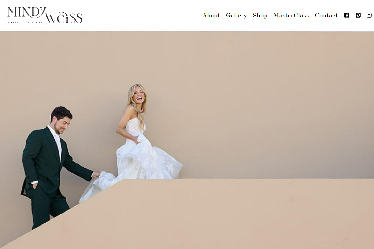
Three decades into a career built on weddings for clients she never has to name twice, Mindy Weiss's homepage (mindyweiss.com, live July 11, 2026) does almost nothing to convert a cold visitor — a deliberate, defensible choice worth understanding before you copy it. The nav holds four sections: About, Gallery, Shop, and Contact. Trust runs almost entirely on press — Harper's BAZAAR, Vogue, People, USA Today — plus a direct client testimonial, rather than on a portfolio filtered by event type. That works when a name alone pre-qualifies decades of demand. It does not translate for a planner a few years into the business: without that press stack, the same minimal portfolio reads as thin rather than confident.
What to copy: lead with the single strongest, most specific press placement you actually have, instead of a generic "as seen in" badge wall. The gap: no visible date field, service tier, or qualification path anywhere on the homepage — an enquiry here appears to depend on referral and reputation alone, a real strategy but not one most planners can lean on from day one.
Bishop-McCann — enterprise corporate meetings and incentive travel
Bishop-McCann (bishopmccann.com, live July 11, 2026) never uses the word "wedding," and that omission is the whole point — this is what a site looks like when it commits fully to one buyer instead of splitting navigation between a couple and a procurement team. The top nav sorts into Expertise, Services, a proprietary measurement tool it calls the "JOY Index," Insights, and About. Trust runs on client logos (Bridgestone, McDonald's, Verizon, Genentech) and stated scale — over a million attendees served, tens of thousands of programs produced — exactly the proof a corporate buyer's procurement or legal team needs, and proof a wedding couple would never look for.
What to copy: name your actual service categories — here, event planning, production, creative design, group air travel, sourcing, and event technology — instead of one vague "services" page. The gap: no visible enquiry form or date field on the homepage; the only path forward is a "Connect" button, which suits an enterprise sales cycle but would frustrate a couple expecting a lighter first step.
David Stark Design & Production — brand experiences, fundraisers, and personal celebrations
David Stark Design (davidstarkdesign.com, live July 11, 2026) runs the clearest buyer-split navigation in this review, solving the couple-versus-corporate problem by making the split the entire menu rather than an afterthought. Under "Work," four named categories — Brand Experiences, Impactful Fundraisers, Personal Celebrations, and Virtual/Hybrid Events — send a nonprofit gala chair and a bride to different pages within one click, each seeing proof relevant to their own decision. Weddings sit inside "Personal Celebrations" rather than as a standalone category, a genuine trade-off: it reads as design-forward rather than wedding-specialist, so a couple searching specifically for wedding proof has to dig one level deeper than on a wedding-only site.
What to copy: name your buyer segments as navigation categories, not as tags buried inside one combined gallery. The gap: no visible service tiers or pricing signal anywhere, and the only listed contact path is a plain email address and office listing — no qualifying fields stand between a visitor and an unstructured inbox message.
Van Wyck — heritage luxury weddings, private parties, and nonprofit galas
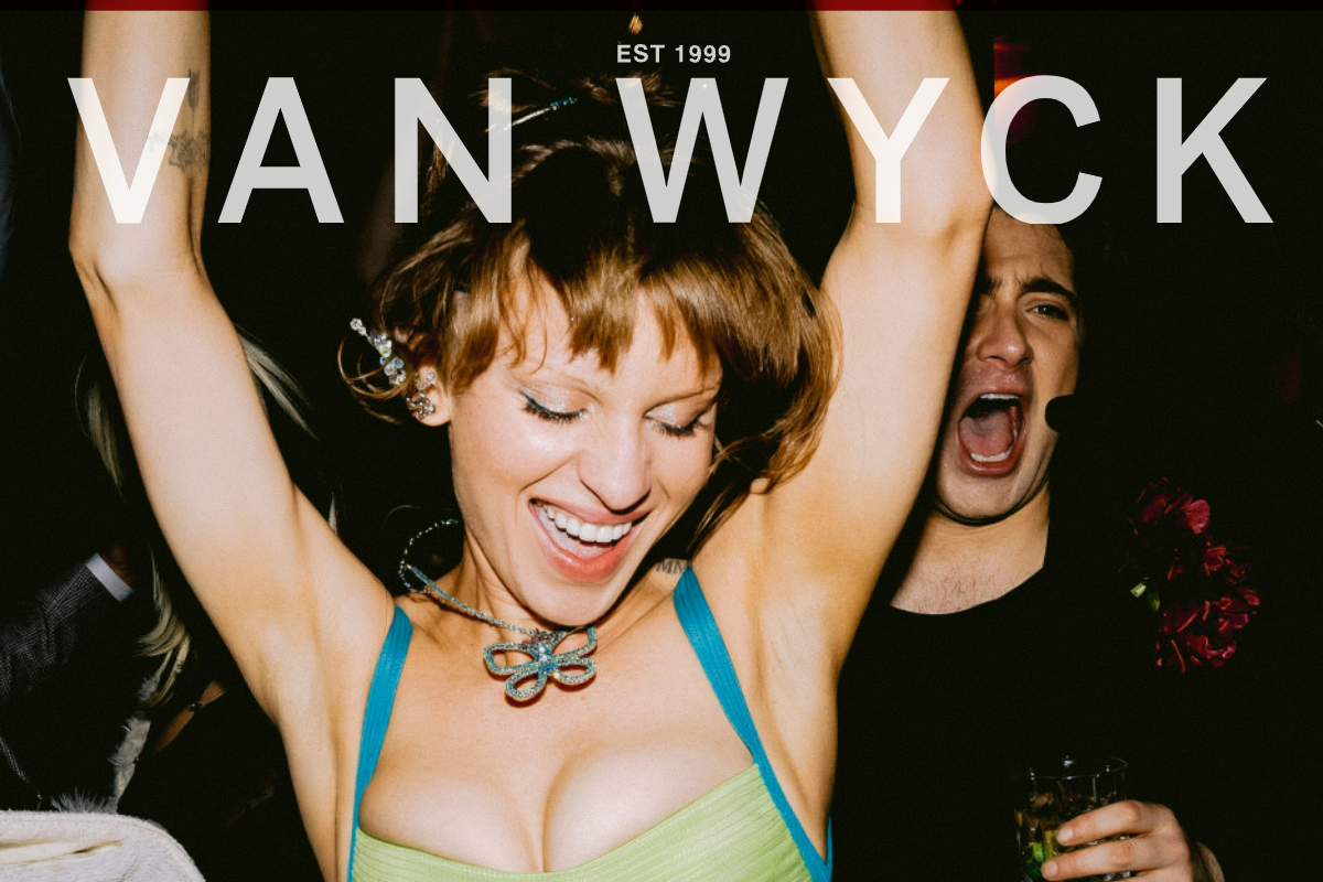
Van Wyck (vanwyck.net, live July 11, 2026) runs five portfolio categories off one homepage — Weddings, Private Parties, Non-Profit, Destination, and Brand Experiences — and backs each with a named, dated case study instead of a generic photo grid: a thirtieth-birthday party, a Super Bowl LIX celebration, a St. Barths wedding, a nonprofit gala. Trust is stacked hard: Vogue, Town & Country, and The Times of London are named directly, alongside a clear "Inquire here" button, a phone number, and an office address. That combination — named case studies plus one obvious next step — is what a considered, months-long buyer actually needs: enough proof to trust the fee, and no confusion about what to click once they do.
What to copy: pair every portfolio category with one specific, named case study instead of a mixed gallery. The gap: no visible date field on the inquiry path itself, and no mention anywhere on the page of event or liability insurance, which a corporate or nonprofit buyer's risk team would likely ask for before signing.
Alison Events — destination weddings, social events, and travel planning
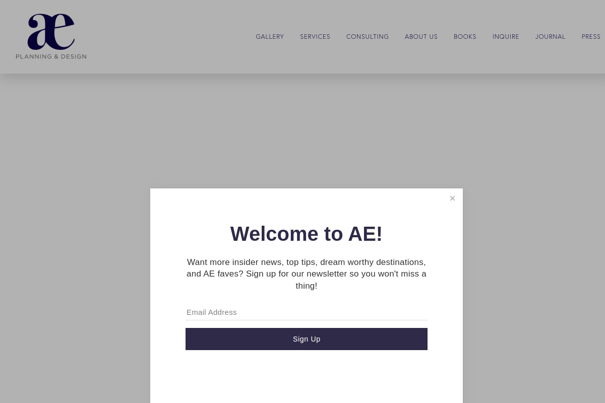
Alison Events (alisonevents.com, live July 11, 2026) is built around a buyer who books more than one thing at once: the nav groups Destination Weddings, Social Events, Honeymoon Travel, and Multigenerational Travel under one "Services" menu, treating the event as one leg of a longer travel relationship rather than an isolated booking. The homepage leads with a published book and a dedicated Press section as its primary trust signal, ahead of any portfolio grid. A distinct "INQUIRE" word sits in the main nav — a small but real signal that separates a genuine enquiry path from a general "Contact" catch-all.
What to copy: give your enquiry path its own nav-level word instead of burying it inside a generic Contact page. The gap: no visible event-type filter inside the gallery, and no service-tier or budget-range language anywhere on the homepage — a couple cannot tell from this page alone whether full planning or day-of coordination is even on offer.
Patterns across the strongest sites
Four patterns repeat across the sites that score best on this scorecard, and each ties directly to event-planner booking economics rather than to visual fashion: portfolio organization by event type or style, real-event features with named vendor credits, transparent service tiers, and an enquiry form built to qualify before it books a discovery call.
Portfolio organization is not one right answer; it depends on which buyer the page is talking to at that moment.
| Organization axis | What it shows a visitor | Best for which buyer | Weakness if used alone |
|---|---|---|---|
| By event type (wedding / corporate / gala / social / nonprofit) | Confirms you have handled their exact kind of event | Both, especially a first-time visitor self-sorting | Does not show your aesthetic range within a category |
| By style or aesthetic (modern, garden, ballroom, minimalist) | Signals a design point of view and range | Couples comparing look and feel across planners | A corporate buyer skips this axis entirely — capability matters more than palette |
| By budget or service tier (full-service, partial, design-only) | Sets expectations before an enquiry is filed | Couples self-selecting a service level | Corporate buyers need capacity and references, not a tier menu |
Real-event features with vendor credits — naming the photographer, venue, and florist alongside a portfolio piece — are a standard events-industry convention, because they signal that other real vendors already trust the planner enough to be named beside their work. None of the five homepages reviewed here surfaced full vendor credits at the homepage level; that detail typically lives one click deeper, inside individual portfolio entries, so do not assume its absence from a homepage means it is missing from the site entirely.
Transparent service tiers and a qualifying enquiry form are the two patterns that were weakest across all five sites in this review — not one of the five named a service tier or asked for an event date on its public homepage. That gap is the single biggest opportunity a planner reading this page can act on immediately, and it costs nothing to fix compared with a full redesign.
This page reviews design and conversion decisions specifically; it does not repeat the Google Business Profile setup workflow covered in theStacc's local SEO guide, or the review-collection and reply process covered in the review management guide. Keeping a portfolio and blog current between projects is a calendar discipline, addressed separately in theStacc's content calendar template and SEO content calendar template.
Design mistakes that cost event planners bookings
The same handful of mistakes recur across event-planner sites that lose bookings before any design opinion matters. Each is fixable, and each shows up often enough among real sites that it is worth checking your own against the list below before you touch a single color or font choice.
- Stock imagery instead of real events — a buyer comparing five planners in one evening can tell a stock photo from a lived event within seconds, and it reads as a warning sign rather than a neutral placeholder.
- No service tiers — without a named tier, an enquiry arrives with no idea whether it wants full planning or day-of coordination, and the mismatch only surfaces on a call that should have been a booking.
- No date field anywhere in the enquiry path — the single most common gap in this review's own five examples; asking for the date first would let a planner disqualify or fast-track an enquiry before writing a single reply.
- Buried contact information — a phone number or inquiry link two levels deep costs a comparison-shopping visitor the ten seconds they were willing to spend finding it.
- Missing trust stack — no mention of insurance, press, or certification leaves a corporate or nonprofit buyer's risk review with nothing to point to before signing.
- Desktop-only layouts — a portfolio or enquiry form that only works well on a large screen loses the couple browsing from a phone on the couch, which is most of them.
Spot one of these on your own site? We can flag which of these six gaps is actually costing you enquiries before you spend a redesign budget guessing.
Turn your redesign into bookings you can measure
A redesign only proves itself through six distinct funnel stages — impression, click, contact-form or inquiry, qualified enquiry, booked event, and completed event — each counted separately with its own source system and owner. Collapsing any two together, like calling a form submission a booking, breaks the one number that tells you whether the redesign actually worked.
| Stage | Business rule | Source system | Owner |
|---|---|---|---|
| Impression | Site or listing shown in a search result or ad | Search Console / ads reporting | Marketing owner |
| Click | Visitor opened the site from that impression | Web analytics | Marketing owner |
| Inquiry / contact | Visitor submitted the enquiry form or placed a call | Form log / call tracking | Web owner |
| Qualified enquiry | Enquiry meets the written date / event-type / budget rule | Intake log or CRM with a source field | Intake owner |
| Booked event | Qualified enquiry signed and paid a deposit for a dated event | Contract / CRM | Lead planner or owner |
| Completed event | Booked event occurred and was closed out in the calendar | Scheduling / CRM | Lead planner or owner |
Google's own analytics guidance recommends distinct lead events such as generate_lead, qualify_lead, working_lead, and close_convert_lead, leaving each business to define exactly when a stage fires (Google Analytics lead-event guidance). An event planner's own written rule for "qualified" should reference the fields below, since these are what separate a real enquiry from one your calendar cannot serve.
| Enquiry-form field | Why it reduces a mismatched enquiry |
|---|---|
| Event date | One date per event means a single conflict disqualifies the enquiry regardless of everything else about the fit |
| Event type | Routes the enquiry to the right tier and staff, and confirms the business even serves that category |
| Guest count | Filters a capacity mismatch — a venue-scale planner is not set up for a twenty-person milestone dinner, and the reverse is also true |
| Venue (if already booked) | Some planners only work specific venues or regions, or need to know if venue-sourcing help is also required |
| Budget range | Filters full-service versus a-la-carte fit before a discovery call occupies an already-scarce slot |
| Referral source | Not a qualifier for this event, but tells the planner which channel or vendor relationship is worth reinforcing |
Only the three rates below are approved for public reporting, and every display must keep every field — no portable benchmark, no promised value.
| Formula | Numerator | Denominator | Evidence window | Source system | Owner | Exclusions |
|---|---|---|---|---|---|---|
| Qualified-enquiry rate | Unique enquiries meeting the written date-available / event-type / budget rule | All unique attributable website enquiries in the same window | One declared 30-day window (recheck across a peak and an off-peak window given the offset calendar) | Website form + CRM with source field | Intake owner | Duplicates, spam, vendor/applicant enquiries, dates already booked, out-of-scope event types |
| Enquiry-to-consultation rate | Unique qualified enquiries that reach a booked discovery consultation | All unique qualified enquiries created in the same cohort | 30-day enquiry cohort plus stated follow-up lag | CRM / scheduling system | Sales/intake owner | Reschedules counted once; no-show consultations flagged separately |
| Consultation-to-booked-event rate | Unique consultations that sign and pay a deposit for a dated event | All unique consultations held in the same cohort | Consultation cohort plus the stated proposal-decision lag | Contract / CRM record | Owner or lead planner | Tentative holds without deposit, dates released, cancellations before deposit |
If the actual constraint is keeping a portfolio and trust stack current between projects rather than the site's structure, that is a content-operations gap before it is a design one. theStacc's Content SEO module researches keywords, builds a keyword map and content calendar, and drafts, scores, and publishes articles to a CMS. The Local SEO module drafts Google Business Profile posts and review replies in your brand voice with an approval mode, manages citations, and tracks rank. The Social Media module schedules posts to your named networks with a preview and approval flow. None of the three redesigns your site or promises more enquiries, bookings, or revenue.
Frequently asked questions
These six questions answer common event-planner website-design searches without repeating the review above; each answer opens with the direct answer in the first sentence and adds a detail not already covered in the body, such as a specific page name, a timing rule, or a compliance boundary.
What makes a good event planner website?
A good event-planner website proves you've handled the buyer's specific kind of event, states your service tiers plainly, and asks for the event date before anything else in the enquiry path. It separates a couple's aesthetic questions from a corporate buyer's capability questions instead of routing both into one generic contact form. Design polish matters far less than whether a stressed, one-shot buyer can self-qualify in under a minute.
What pages should an event planner's website have?
Beyond a homepage and portfolio, most planners need a services page naming distinct tiers — full planning, partial or month-of, day-of coordination, design-only — a dedicated corporate or nonprofit-events page if that buyer is part of the mix, a trust or press page, and a real enquiry form rather than a plain "contact us" mailto link. A short FAQ page covering timeline and deposit process cuts down repeat emails before a discovery call.
Should an event planner's website separate weddings from corporate events?
Yes, when both are a real part of the business: a couple evaluates aesthetic and portfolio depth on a browsing timeline of weeks, while a corporate or procurement buyer evaluates capacity, insurance, and references against a budget deadline — proof that satisfies one rarely satisfies the other. A navigation split lets each buyer skip content meant for the other, shortening the path to a qualified enquiry. A planner serving only one buyer type can skip the split entirely.
How do event planners show their work without breaking client privacy?
Real planners get written permission before publishing client photos, and many private or corporate clients — proposals, executive events, some galas — require anonymized details or delayed posting rather than same-week publication. A safer default is naming the vendors, such as the photographer, venue, and florist, rather than the client, and holding sensitive event photography until the client has explicitly cleared it for the portfolio. Review replies should follow the same privacy discipline.
What contact-form fields should an event planner ask for?
At minimum: event date, event type, estimated guest count, whether a venue is already booked, a budget range, and a referral source. Make date and event type required, since either alone can disqualify an enquiry regardless of budget; leave budget as a set of ranges rather than an open number field, because an open field is where most enquiry forms lose a completion. Skip any field you have no process for actually using.
How often should an event planner redesign or refresh their website?
Redesign rarely; refresh constantly. A full redesign is worth considering every three to five years or after a real repositioning, such as adding corporate events or dropping a buyer type, but the portfolio, trust stack, and any seasonal-availability language need checking every quarter, and again right before your peak enquiry window opens — typically late fall for wedding season and Q3 for Q4 corporate work.
Score your own site before your next redesign
Score your own site against these seven scorecard criteria before you compare a single hero image to a competitor's: proof of real events, clear service tiers, a date-first enquiry path, a genuine trust stack, buyer-split navigation, and phone-fast performance. Everything else is a style preference, not a booking decision.
The five sites reviewed here are not a client roster, a leaderboard, or a promise that copying any one pattern fills your calendar. They are dated, independently verified evidence of what real event-planner sites do well and where even strong sites still leave an enquiry unqualified. The single biggest, cheapest fix across every site in this review was the one none of them had: a visible date field before a single word about aesthetics.
Ready to turn this scorecard into your own redesign brief? Bring your current site and we will map it against these seven criteria and hand you a prioritized fix list.
Sources & references
- Google Business Profile Help — representing a service-area business
- Google Business Profile Help — getting reviews and protecting privacy
- Google Analytics Help — recommended lead events and business-defined stages
- Google Search Central — creating helpful, people-first content
- Google Search Central — writing high-quality reviews

Explore the tools for blog content, Google Business Profile, and social publishing.
Weekly local SEO teardowns
One practical email a week. Map Pack, GBP, AI Overviews. No fluff. Unsubscribe anytime.