Mobile product page optimization guide for 2026. Speed targets, thumb-zone CTAs, schema markup, and the 12-step audit that lifts conversions and rankings.
Your best customers shop on a phone. They scroll fast, judge faster, and leave the second a page hesitates.
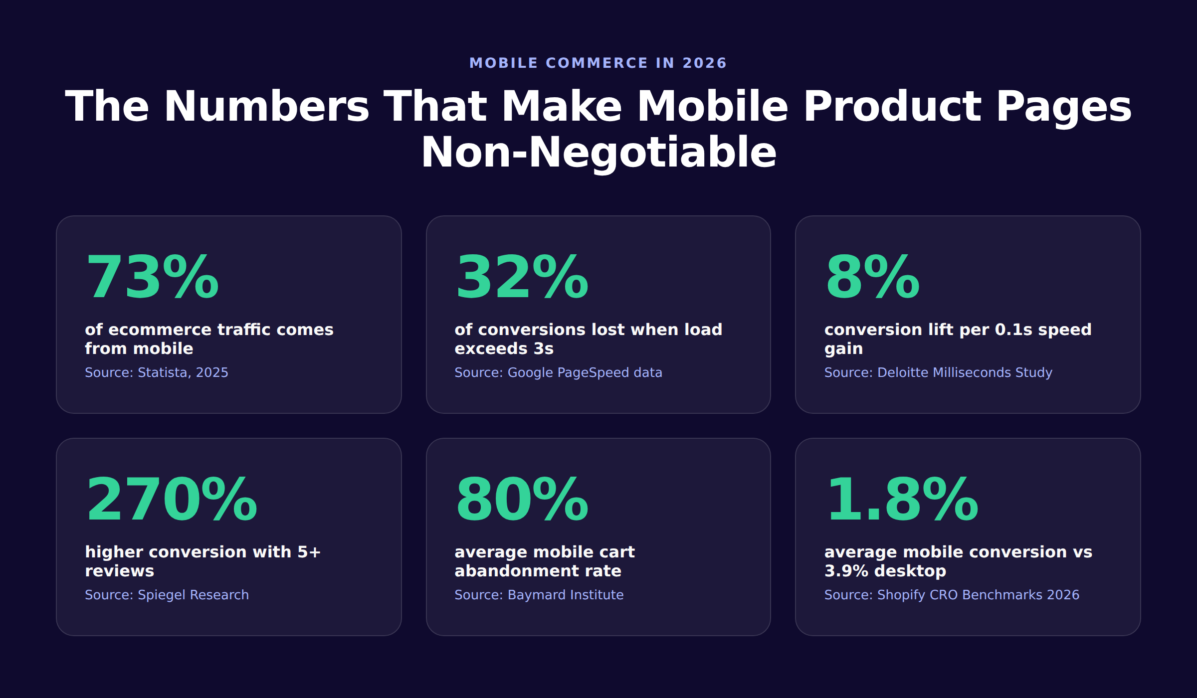
73% of ecommerce traffic now happens on mobile, yet the average mobile conversion rate sits at 1.8% versus 3.9% on desktop. That gap is not a device problem. It is a product page problem. Every slow load, mistyped tap, and hidden Add to Cart button compounds into lost revenue you never see in your dashboard.
Mobile product page optimization is the discipline of fixing that gap. It blends Core Web Vitals work, thumb-zone design, schema markup, and smart content order. The result: a shopper can land, trust the page, and buy in under 90 seconds. This guide gives you the exact playbook we use to ship product pages that rank and convert.
We publish 3,500+ blogs across 70+ industries and have audited hundreds of ecommerce sites where mobile speed was the single biggest lever for revenue. The recommendations below come from that real-world stack, not a theory.
Here is what you will learn:
- What mobile product page optimization is and why Google rewards it
- The 6 Core Web Vitals targets every product page must hit
- How to design CTAs for the thumb zone
- The 12-step PDP audit we run before publishing
- How to use schema markup to win rich results on mobile
- Mobile-specific copywriting rules for product pages
- A real conversion flow showing where pages leak money
- The most common mistakes that quietly tank your mobile rankings
What Is Mobile Product Page Optimization
Mobile product page optimization is the practice of designing and tuning ecommerce product detail pages (PDPs) for shoppers on phones. It covers four layers: speed, layout, content, and structured data. The goal is to remove friction between landing and purchase while signaling relevance to Google.
A high-converting mobile PDP loads the hero image and Add to Cart inside the first viewport. It responds to taps in under 200 milliseconds. Reviews, price, and stock surface without forcing the user to hunt. A poor mobile PDP looks the same as the desktop version, just shrunk.
Why Mobile PDPs Are Different From Desktop
Desktop shoppers read. Mobile shoppers scan and tap. The screen is 320 to 428 pixels wide, the input is a thumb, and the connection is often a flaky LTE signal. That changes what works.
| Factor | Desktop PDP | Mobile PDP |
|---|---|---|
| Avg viewport width | 1440px | 390px |
| Primary input | Mouse + keyboard | Thumb tap |
| Avg load time | 2.5s | 8.6s |
| Conversion rate | 3.9% | 1.8% |
| Cart abandonment | 70% | 80% |
| Session length | 4-6 minutes | 90 seconds |
The data above comes from Shopify and Baymard 2026 benchmarks. The takeaway is sharp: a mobile PDP gets half the conversion and a quarter of the time. Every design choice must respect that.
Why Google Cares About Mobile PDPs
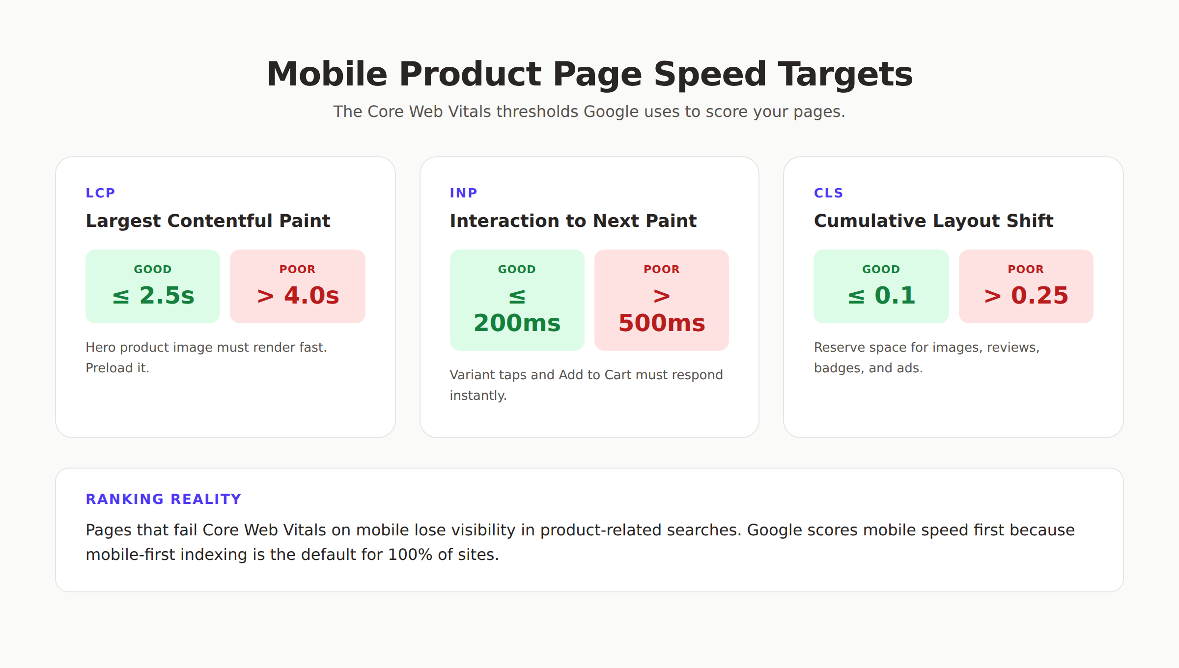
Google switched to mobile-first indexing for 100% of sites in 2024. That means the crawler reads your mobile HTML, scores your mobile speed, and ranks based on your mobile experience. If your mobile PDP is missing reviews, has a slower LCP, or breaks on small screens, you lose ranking on every device.
Product pages also trigger AI Overviews and shopping carousels. Google extracts price, reviews, availability, and shipping data directly from your product schema on mobile. A clean mobile PDP with valid markup gets cited. A bloated, image-heavy desktop port does not.
Stop guessing what is broken on mobile. We rebuild your product pages for speed, schema, and conversion. Start a Content SEO module for free. Start your 3-day trial →
The 6 Speed Targets Every Mobile PDP Must Hit
Speed is the foundation. A beautiful PDP that loads in 5 seconds loses 32% of its shoppers before the hero image even paints. Google scores three Core Web Vitals on mobile, and our team adds three operational metrics on top.
1. Largest Contentful Paint (LCP) Under 2.5 Seconds
LCP measures when the main hero element finishes rendering. On a product page, that is almost always the hero product image. Aim for 2.0 seconds or faster on a slow 4G connection.
Tactics that work:
- Preload the hero image with
<link rel="preload" as="image">in the head - Serve WebP or AVIF formats, not JPEG
- Set explicit
widthandheightattributes to prevent reflow - Use a CDN with edge caching for product images
- Strip third-party scripts that block the critical render path
2. Interaction to Next Paint (INP) Under 200 Milliseconds
INP replaced First Input Delay in March 2024. It measures the longest tap-to-paint delay across the whole session. Variant pickers, gallery swipes, and Add to Cart all count. Anything over 500ms feels broken.
The fastest INP wins come from killing JavaScript debt: defer non-critical scripts, lazy-load reviews widgets, and break up long tasks. If your variant picker re-renders the whole page on each tap, refactor it.
3. Cumulative Layout Shift (CLS) Under 0.1
CLS is the silent conversion killer. A user moves their thumb toward Add to Cart, a banner ad loads, and they accidentally subscribe to a newsletter instead. Reserve space for every dynamic element: reviews widget, badges, sticky banners, and image carousels.
Set aspect-ratio on image containers. Skeleton-load review summaries. Never inject ads above the fold.
4. Time to First Byte (TTFB) Under 600 Milliseconds
TTFB is not a Core Web Vital, but it caps your LCP. If your server takes 1.2 seconds to respond, no amount of image optimization gets you under 2.5s LCP. Move to edge rendering, use a faster ecommerce stack, or upgrade hosting.
Shopify Hydrogen, Next.js Commerce, and Magento PWA Studio all deliver TTFB under 200ms when configured correctly. Read our Shopify Core Web Vitals guide for the platform-specific tuning.
5. JavaScript Bundle Under 200KB
Mobile networks choke on big bundles. A 600KB JavaScript payload on a slow 4G connection adds 3 seconds of parse and execute time before anything paints. Audit your bundle with Lighthouse and remove every script that does not earn its weight.
The biggest offenders we see:
- Multiple analytics tags loading the same data
- A/B testing libraries fully imported
- Carousel libraries when CSS scroll-snap works fine
- jQuery loaded for one component
- Marketing pixels firing on page load instead of lazy
6. Total Page Weight Under 1MB
A typical desktop PDP ships 3 to 4 megabytes. On mobile, that is a death sentence. Target 1MB or less, with the hero image taking no more than 150KB.
Compress aggressively. Use srcset and sizes so phones download the 390px-wide version, not the 1920px desktop hero. Move below-the-fold images to lazy loading with loading="lazy".
Our page speed optimization guide covers the full audit process. For deeper technical work, follow our improve Core Web Vitals walkthrough.
Design for the Thumb Zone
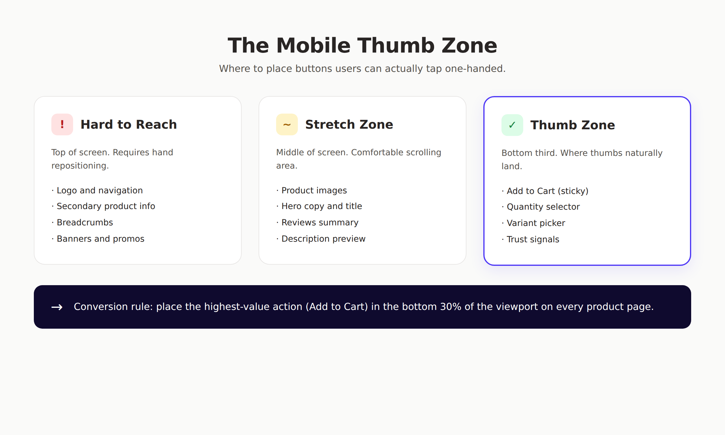
A phone is held one-handed 49% of the time. The thumb can only comfortably reach the bottom half of the screen. Buttons placed at the top force the user to reposition the device, which often means they put the phone down instead.
Place Primary Actions in the Bottom Third
The "thumb zone" is the bottom 30% of the screen on any phone. Every high-value action on a product page belongs there:
- Sticky Add to Cart button
- Quantity selector
- Buy Now / Apple Pay / Shop Pay buttons
- Variant picker (color, size)
Stack these vertically when possible. Avoid putting them in a horizontal row that requires precise tapping.
Tap Target Sizes That Actually Work
Google recommends 48x48 CSS pixels minimum. Apple recommends 44x44. We default to 48x48 with 8 pixels of padding around every interactive element. That prevents the rage-tap moment when a user hits the wrong variant.
The 40% of stores that fail to support pinch-zoom or proper tap targets lose conversions they will never recover. Test every CTA on a real phone, not just Chrome DevTools.
Sticky Add to Cart Is Non-Negotiable
A sticky Add to Cart bar pinned to the bottom of the viewport lifts mobile conversion rates by 10 to 15% on average. The shopper never has to scroll back up. They see the price, the button, and the trust signals at all times.
Build it with position: fixed; bottom: 0; and reserve space at the bottom of the body so it does not cover content. Hide it when the user reaches the in-page Add to Cart to prevent duplication.
Variant Pickers: Icons Over Text
A dropdown menu with 8 size options destroys mobile conversion. Replace it with a horizontal scroll of variant chips. Use icons for color swatches, not the word "blue". Use letter chips for sizes (XS, S, M, L). The shopper can tap their choice without opening a modal.
| Bad Mobile Variant UX | Good Mobile Variant UX |
|---|---|
| Dropdown with text labels | Horizontal chip row |
| "Color: Select" placeholder | Visible color swatches |
| Full page reload on change | Instant inline update |
| Hidden behind "Options" tab | Above the fold |
| Locked unselected state | Smart default selection |
Content Hierarchy for Mobile PDPs
Mobile shoppers see one screen at a time. That makes the order of information life or death. Get the first viewport right and they keep scrolling. Get it wrong and they bounce.
What Belongs Above the Fold
The first 600 pixels of vertical space on a phone is your billboard. Pack only what answers "is this the right product?" into that zone:
- Product name (one line, scannable)
- Hero image (with carousel indicator dots)
- Star rating + review count
- Price + any discount marker
- Stock indicator ("In stock" or "3 left")
- Primary CTA (Add to Cart)
Everything else moves below the fold or behind a collapsible section.
Use Progressive Disclosure for Descriptions
Desktop pages can show 500 words of description. Mobile cannot. Show the first 2-3 lines, then add a "Read more" toggle. Most shoppers skim the bullets and tap Add to Cart. Power buyers tap to expand.
Format descriptions as scannable bullets:
- What it is: One-sentence summary
- Who it is for: The audience and use case
- Key features: 3-5 bullets, benefit-first
- What is in the box: Itemized list
- Sizing or fit notes: Specific guidance
This structure earns featured snippets and AI Overview citations because Google parses bullets faster than paragraphs. Our on-page SEO guide details the exact patterns we use.
Surface Reviews Early, Not at the Bottom
Reviews are the single biggest trust signal on a mobile PDP. Products with 5 or more reviews convert 270% better than products with zero. Yet most ecommerce sites bury the reviews section near the footer.
Show three things in the top viewport:
- Star rating with count ("4.7 stars, 312 reviews")
- A single highlighted review snippet
- A "Read all reviews" link that scrolls to the full section
This satisfies the trust check inside 2 seconds. For more on review-driven conversion, see our Google reviews ranking signals breakdown.
Shipping and Returns Above the CTA
49% of cart abandonment comes from unexpected costs at checkout. Solve it upstream. Place a short "Free shipping over $50" or "Ships in 2 days" line directly under the Add to Cart button. Add a tappable returns link nearby.
Shoppers who know the total cost before they tap Add to Cart convert 23% higher and abandon 31% less at checkout.
The 12-Step Mobile PDP Audit
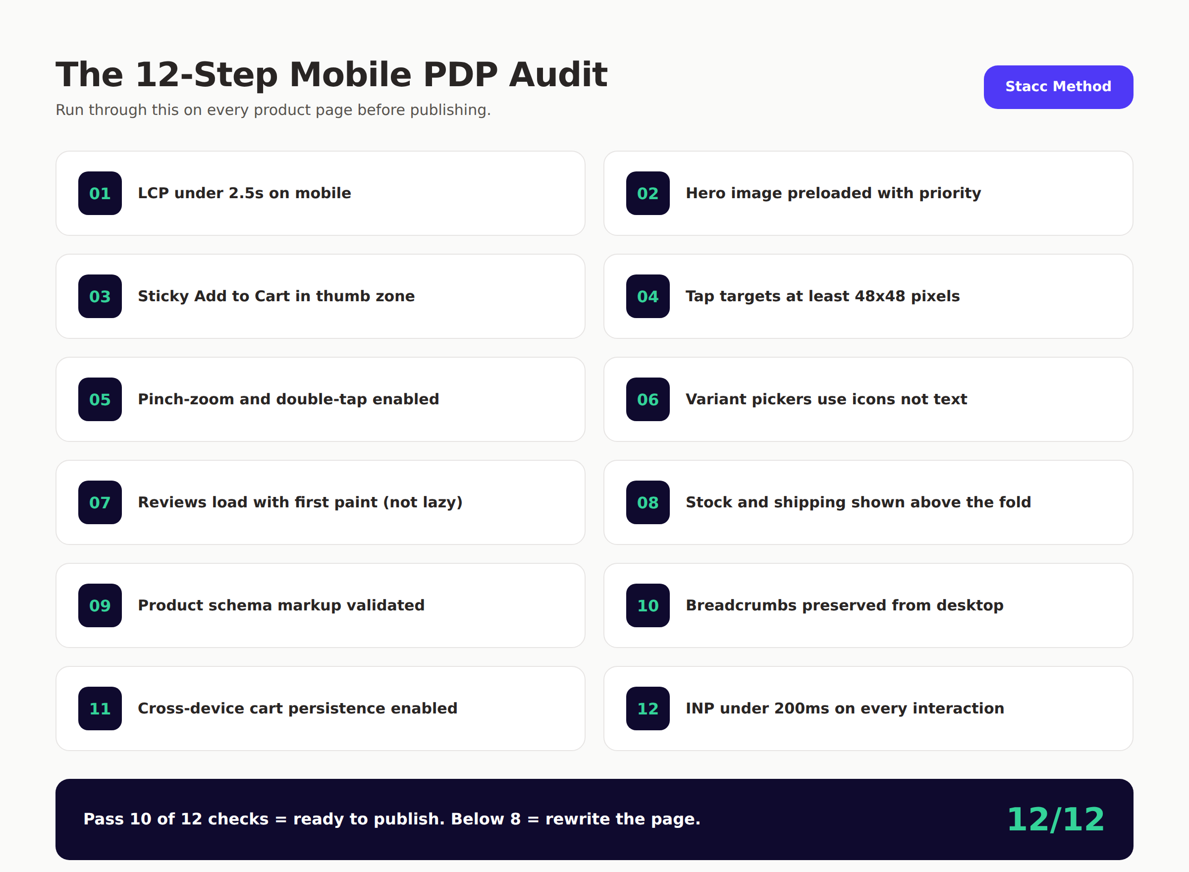
Every product page on every ecommerce store we run goes through this 12-point audit before it ships. Use it as a final gate.
theStacc Mobile PDP Checklist
- ✓ LCP under 2.5 seconds on slow 4G simulation
- ✓ Hero image preloaded with
fetchpriority="high" - ✓ Sticky Add to Cart visible in the bottom 30% of every screen
- ✓ Tap targets at least 48x48 pixels with adequate spacing
- ✓ Pinch-zoom and double-tap zoom enabled on product images
- ✓ Variant pickers use chips or swatches, not dropdowns
- ✓ Reviews summary loaded in the first paint, not lazy
- ✓ Stock and shipping shown above the fold
- ✓ Product schema markup validated with Google Rich Results Test
- ✓ Breadcrumb navigation preserved from desktop
- ✓ Cross-device cart persistence enabled
- ✓ INP under 200ms on every interaction (variant, gallery, cart)
A page must hit at least 10 of the 12 to publish. Anything below 8 means rebuild before launch. We run this audit on every PDP we touch because shipping a broken mobile page is more expensive than slowing the release.
How to Run the Audit Fast
Open the page on a real Android device. Throttle the network to Slow 4G in Chrome DevTools remote debugging. Tap through the entire flow: variant select, gallery swipe, reviews scroll, Add to Cart. Note every delay over 200ms and every tap that lands on the wrong target.
If your team does not have time for manual audits, automate them with Lighthouse CI in your deployment pipeline. Set a passing score of 90 for performance and 95 for accessibility. Anything below that fails the build.
Schema Markup for Mobile Product Pages
Google reads your mobile HTML first. The cleaner your structured data, the more often your product earns rich results, AI Overview citations, and shopping carousel inclusion.
The Minimum Product Schema You Need
Every mobile PDP must ship with valid Product schema. The minimum fields:
{
  "@context": "https://schema.org",
  "@type": "Product",
  "name": "Product Name",
  "image": "https://cdn.example.com/product.jpg",
  "description": "Short product summary.",
  "brand": { "@type": "Brand", "name": "Brand Name" },
  "offers": {
    "@type": "Offer",
    "price": "49.99",
    "priceCurrency": "USD",
    "availability": "https://schema.org/InStock",
    "shippingDetails": { "@type": "OfferShippingDetails" }
  },
  "aggregateRating": {
    "@type": "AggregateRating",
    "ratingValue": "4.7",
    "reviewCount": "312"
  }
}
Validate with Google's Rich Results Test before every release. A single broken property silently strips your page from rich results on mobile.
Schema Properties That Win More Real Estate
Beyond the basics, three properties pull more visibility on mobile SERPs:
shippingDetails— Shows free shipping badges in Google ShoppinghasMerchantReturnPolicy— Adds "Free returns" labelsreviewwith individual review objects — Triggers review stars in AI Overviews
Our product page schema guide covers every property and the exact JSON-LD pattern we ship. For broader implementation, see our structured data guide and schema markup SEO guide.
Common Schema Mistakes on Mobile PDPs
Three errors we see on almost every audit:
- Missing
priceValidUntilon sale items, which Google now flags as an error - Inconsistent currency between schema and visible price
- Wrong
availabilityURL (using "InStock" instead of "https://schema.org/InStock")
These small breaks cost ranking. Validate every template, not just one product, since variant differences often slip through.
We handle Core Web Vitals, schema, and content for you. 30 articles per month, 92% average SEO score, $99/month. See pricing →
Mobile-Specific Copywriting Rules
Words on a mobile PDP work harder than words anywhere else. There is less space, less attention, and more competition. Every line either earns the next scroll or kills the sale.
Write Titles Under 65 Characters
Long product titles wrap to three lines on mobile and push the price below the fold. Keep titles under 65 characters including spaces. Front-load the most searched terms.
Bad: "The Beautiful Hand-Stitched Italian Leather Crossbody Bag for Modern Women" Good: "Italian Leather Crossbody Bag — Hand-Stitched Modern Style"
The second version ranks for the same searches and keeps the entire above-the-fold layout intact on a 390px screen.
Use Short Sentences and Short Paragraphs
A mobile screen holds 5 to 6 lines of text. Anything longer wraps and feels endless. Cap sentences at 18 words. Cap paragraphs at 3 lines on mobile. Use white space to break visual density.
Lead With Benefits, Not Features
A spec sheet works on desktop. On mobile, a shopper needs to know "what will this do for me" in one line. Lead with the benefit, then back it with the spec.
| Feature-First (Weak) | Benefit-First (Strong) |
|---|---|
| 600D ripstop nylon shell | Survives the toughest commute, made from 600D ripstop nylon |
| 5000mAh battery | All-day charge on a 5000mAh battery |
| 4.5" stainless steel blade | Slices through a tomato cleanly with a 4.5" stainless blade |
Our SEO content writing guide and content writing tips detail the full copy framework. For ecommerce-specific patterns, see our AI-optimized product descriptions walkthrough.
Avoid Modal Pop-ups on Mobile
Google penalizes intrusive interstitials on mobile. A "Subscribe for 10% off" modal that covers the product blocks both ranking and conversion. Replace pop-ups with inline banners, exit-intent triggers tied to scroll depth, or post-purchase offers.
If you must use a modal, fire it only after 60 seconds of dwell time or 75% scroll depth. Never on the first page view.
The 5-Stage Mobile Conversion Flow
Mobile shoppers move through 5 micro-decisions between landing and tapping Add to Cart. Every stage has a job. Skip any one and the sale leaks.
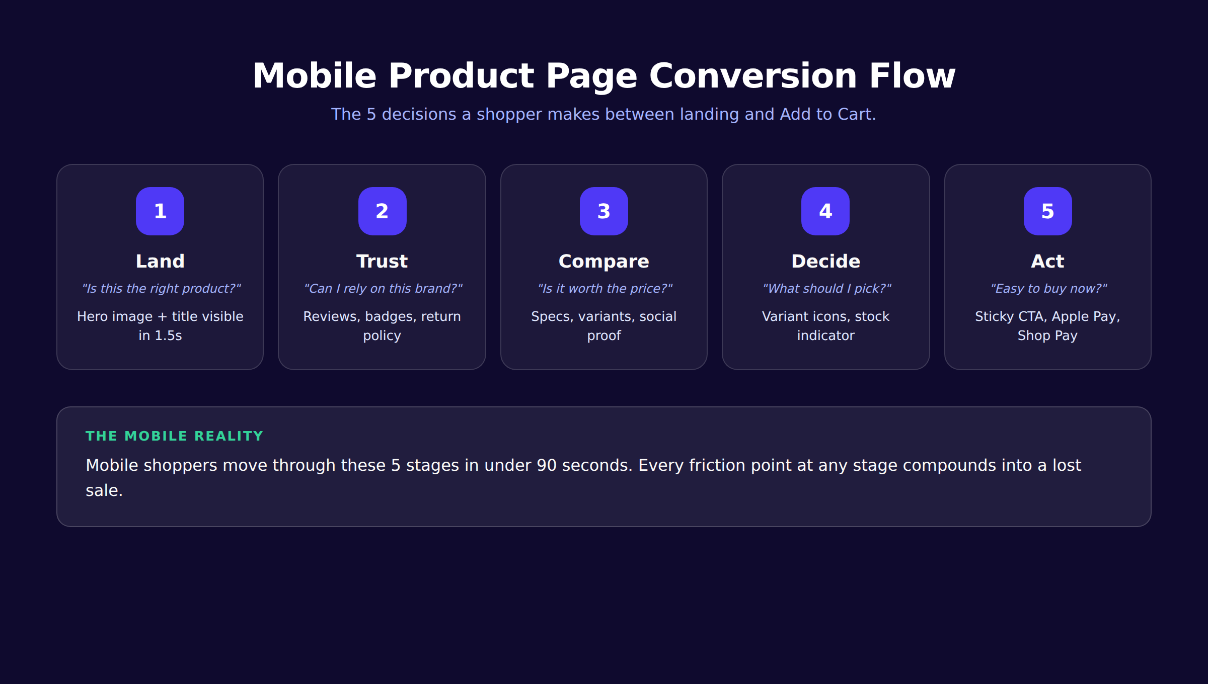
Stage 1: Land
The shopper arrives from a search, an ad, or a social link. They are asking "is this the product I want?" Answer it instantly with a clear hero image, a title that matches their search query, and a price visible without scrolling.
If the hero image takes more than 2 seconds to paint, the shopper leaves. Optimize the hero. Always.
Stage 2: Trust
Once they recognize the product, they ask "can I rely on this brand?" Trust signals must appear in the first scroll: star rating, review count, return policy, security badges, and shipping promise.
A trust gap loses you 50% of the shoppers who otherwise want to buy.
Stage 3: Compare
The shopper now asks "is it worth the price?" They compare your product to memory, to the tab they have open, and to alternatives in their head. Show specs, variants, and social proof. Use comparison language ("most popular size", "best seller", "limited stock").
Stage 4: Decide
Decision is where most mobile PDPs fumble. The shopper has to pick a variant, a quantity, and any add-ons. Make every choice tap-friendly. Use smart defaults (the most-purchased size pre-selected). Show variant-specific images.
Stage 5: Act
The final tap. Sticky CTA, fast payment options (Apple Pay, Google Pay, Shop Pay), and zero distractions. Strip every link, banner, or pop-up that competes for attention at this stage.
A clean Act stage moves abandonment from 80% to under 60% on mobile in our audits. The math compounds across every product.
Mobile PDP Mistakes That Tank Rankings
After auditing hundreds of ecommerce sites, the same mistakes appear over and over. Fix these first.
Mistake 1: Loading Reviews via Third-Party Iframe
Reviews loaded inside an iframe widget do not get indexed by Google as part of the page. You lose the review text, the rating, and the schema benefit. Render reviews server-side in the HTML, then enhance with JavaScript.
Mistake 2: Hiding Specs Behind Tabs
A "Specifications" tab that requires a tap to expand is invisible to most mobile shoppers. Worse, Google sometimes treats tab content as lower-priority. Expand the specs by default on mobile or use an accordion that is open by default.
Mistake 3: Different Content on Mobile and Desktop
Some sites strip "secondary" content from the mobile version to save space. Google indexes only the mobile version. That stripped content disappears from search. Maintain full content parity between desktop and mobile, just rearranged for the smaller screen.
This is one of the most common issues we find. Read our mobile SEO guide for the full content parity playbook.
Mistake 4: Auto-Playing Video Above the Fold
Auto-play video kills LCP, eats data, and triggers Chrome's "this site uses excessive resources" warning. Use a video poster image and require a tap to play. The video becomes an engagement asset, not a performance disaster.
Mistake 5: Modal Image Galleries That Block Scrolling
A "tap to enlarge" feature that opens a fullscreen modal often traps the user. They cannot scroll back, swipe gestures conflict, and the back button leaves the site entirely. Use inline zoom or a swipeable lightbox that closes cleanly with one tap.
Mistake 6: Skipping the Mobile Cart Test
Most ecommerce teams test desktop checkout weekly and mobile checkout never. The bugs hide in cross-device sync, variant persistence, and Apple Pay flow. Run a real mobile purchase every week, on both iOS and Android.
Mistake 7: Ignoring INP After Variant Selection
A common pattern: tap a variant, the page locks for 600ms while React re-renders. INP fails, conversion drops. Move variant updates to local state, defer image swaps, and lazy-load the variant-specific schema update.
How Mobile PDPs Earn AI Overview Citations
Google's AI Overviews now appear above the standard SERP for many product queries. Mobile PDPs that get cited there pull qualified traffic that desktop pages cannot. The mechanics matter.
What Gets Cited
AI Overviews extract three things from product pages:
- Direct answers ("how do I size this", "is it waterproof")
- Specifications (dimensions, materials, compatibility)
- Trust data (review count, rating, return policy)
Pages with clear Q&A blocks, structured spec tables, and complete schema get pulled more often. Pages with marketing fluff get skipped.
Optimize for AI Citability
Add a "Common Questions" section to every PDP. Format each as a clear question and a 1-2 sentence answer. Use the same questions shoppers ask in support emails.
Wrap the section in FAQPage schema. Each Q&A becomes a candidate for direct citation.
Our get cited in AI search guide and FAQ content for AI Overviews walk through the exact structure. For tracking results, see our track AI search visibility guide.
Mobile-First, Then Everywhere
Google's AI Overview engine reads the mobile version first. If your mobile PDP is missing the spec table or the FAQ block, the desktop version does not save you. Build the mobile-first, then port up.
Tools and Workflow for Mobile PDP Optimization
The right toolkit makes mobile PDP work systematic instead of guesswork. Here is what we use on every project.
The Audit Stack
| Tool | What It Catches | Frequency |
|---|---|---|
| Lighthouse | Core Web Vitals, accessibility, SEO basics | Every release |
| WebPageTest | Real-device performance on slow networks | Monthly |
| Chrome DevTools | INP, layout shifts, network waterfall | Every PR |
| Google Rich Results Test | Schema validation | Every template change |
| PageSpeed Insights | Field data from real users | Weekly |
| Search Console | Mobile usability errors, indexing issues | Daily |
Run Lighthouse in CI on every pull request. Run WebPageTest monthly to catch real-world degradation. Watch Search Console for the early warnings.
The Build Workflow
The team that ships fast mobile PDPs follows a simple loop:
- Design with mobile-first wireframes — sketch the 390px viewport first
- Build with the mobile bundle — code-split desktop enhancements
- Test on real devices — at least one Android, one iPhone, every release
- Measure with field data — Core Web Vitals from real users, not just lab
- Iterate weekly — small changes compound faster than full redesigns
Our technical SEO checklist details the full release process.
The Content Workflow
Mobile PDP content needs the same rigor as code:
- Write descriptions mobile-first (90 words or less for the primary block)
- Bullet every spec
- Test titles at 390px width before publishing
- Validate schema after every CMS update
- Re-shoot hero images for vertical-friendly aspect ratios
If you need help operating this content workflow at scale across hundreds of products, our Content SEO module handles publishing, schema, and optimization end-to-end.
Mobile PDP Optimization for Specific Platforms
Different ecommerce platforms have different mobile defaults. The general principles apply, but a few platform-specific tweaks unlock big wins.
Shopify
Shopify themes ship with reasonable mobile defaults, but the third-party app ecosystem destroys performance fast. Audit every app for mobile bundle impact. Use Shopify Hydrogen or a headless setup for full speed control.
Read our Shopify SEO guide, Shopify Core Web Vitals guide, and Shopify Hydrogen SEO walkthrough for the full Shopify playbook.
WooCommerce
WooCommerce mobile performance depends on the theme and the host. Use a lightweight theme like GeneratePress or Astra. Move to a managed host with edge caching. Strip unused plugins aggressively.
Magento and Adobe Commerce
Magento ships heavy by default. Magento PWA Studio gives you mobile-first speed but requires real engineering investment. For most stores, a headless front-end on Next.js or Nuxt delivers the fastest mobile experience.
BigCommerce
BigCommerce's Stencil framework is solid for mobile but limits customization. Use the Catalyst headless framework if you need full control over the mobile PDP experience.
Custom Builds
If you build your own stack, optimize for the mobile bundle from day one. Next.js Commerce, Remix, and Astro all deliver excellent mobile performance when configured for edge rendering.
Measuring Mobile PDP Success
You cannot improve what you do not measure. The metrics that matter on mobile PDPs differ from desktop, and from sitewide ecommerce KPIs.
The 6 Metrics to Track Weekly
- Mobile conversion rate by product category
- Mobile LCP, INP, CLS (75th percentile field data)
- Mobile bounce rate on PDPs specifically
- Add to Cart rate on mobile vs desktop
- Mobile cart abandonment at the checkout stage
- Mobile organic impressions for product queries
Track these in a single dashboard. Compare week-over-week and segment by product category. The patterns reveal which PDPs need attention.
What "Good" Looks Like
After optimization, expect these benchmarks:
| Metric | Pre-Optimization | Target | Best-in-Class |
|---|---|---|---|
| Mobile LCP | 4.5s | <2.5s | <1.8s |
| Mobile INP | 480ms | <200ms | <100ms |
| Mobile conversion | 1.5% | 2.5% | 4.0% |
| Add to Cart rate | 8% | 14% | 22% |
| Cart abandonment | 82% | 68% | 55% |
These targets assume a mid-sized DTC ecommerce site. Larger marketplaces have different baselines, but the relative improvements still apply.
Connect SEO to Revenue
The hardest part of mobile PDP optimization is proving the ROI. Tie every speed and schema change to a revenue line item. Use Google Analytics 4 with the e-commerce events configured. Match Search Console impressions to GA4 sessions to revenue.
Our measure content marketing ROI and content marketing metrics guides cover the attribution framework in detail.
What practitioners are saying on X
AI search advice ages quickly. Here is high-signal public discussion from SEO and growth operators — context for your roadmap, not a substitute for primary data.
- @hridoyreh (Mar 2026): Widely shared SEO skill tree: foundations, research, technical, on-page, content, links, AI SEO/GEO, analytics, UX, brand, programmatic — useful map for stats and how-to posts. See the post on X.
- @jakezward (Feb 2026): 2026 SEO predictions emphasize AI Overview share-of-SERP, schema for LLM token efficiency, brand mentions in AI answers as a KPI, proprietary data as a moat, and content refresh beating net-new AI slop. See the post on X.
Grok, AI Overviews, and multi-engine visibility
For “mobile product page optimization”, multi-engine visibility still starts with clear definitions, sourced numbers, and extractable section answers. Grok additionally factors live X discussion — keep public claims consistent with this page.
- Google AI Overviews: Use passage-ready answers, tables, and FAQ schema where relevant.
- ChatGPT / Perplexity: Cite named sources next to key claims.
- Grok: Maintain accurate entity facts on-site and in high-signal X posts.
Frequently Asked Questions
Mobile product page optimization is the process of designing and tuning ecommerce product detail pages for shoppers on smartphones. It covers page speed, layout, content hierarchy, tap-friendly design, and structured data. The goal is to reduce friction between landing and purchase while signaling product relevance to Google's mobile-first index.
A mobile product page should hit a Largest Contentful Paint under 2.5 seconds on a slow 4G connection. Best-in-class pages load in under 1.8 seconds. Every 0.1 second of speed gain typically lifts mobile conversion by 8%, so the investment pays back fast.
The thumb zone is the bottom 30% of a phone screen where users can comfortably tap with one hand. Primary actions like Add to Cart, variant pickers, and checkout buttons belong in this zone. Placing them at the top of the page forces users to reposition the device, which causes drop-off.
Yes. Google switched to mobile-first indexing for 100% of sites in 2024, which means the crawler reads your mobile HTML and scores your mobile speed. Fast, well-structured mobile product pages rank higher on every device. They also earn more AI Overview citations and Google Shopping placements.
Every mobile product page needs Product schema with name, image, description, brand, offers (price, currency, availability), and aggregateRating. Adding shippingDetails and hasMerchantReturnPolicy unlocks additional rich result features like free shipping badges and return policy labels.
Use Lighthouse for lab data on Core Web Vitals, accessibility, and SEO. Use PageSpeed Insights for field data from real users. Use Google's Rich Results Test for schema validation. Use Chrome DevTools remote debugging on a real Android device for INP and tap target testing. Run all four every release.
Yes. Google indexes only the mobile version of your site, so any content stripped from mobile disappears from search results. Maintain full content parity between desktop and mobile, but rearrange the layout for the smaller screen. Use progressive disclosure (expandable sections) instead of removing content entirely.
Ship the Mobile PDP, Win the Revenue
Mobile product page optimization is not one project. It is a discipline that touches engineering, content, and design every week. The teams that win at it treat the mobile PDP as the primary surface of the brand, not a smaller version of the desktop site.
Start with the 12-step audit on your top 10 products by revenue. Fix LCP and INP first. Move the sticky Add to Cart into the thumb zone. Validate the schema. Then measure for a month and reinvest the lift into the next 10 products.
If you want a partner who handles the content layer end-to-end, we ship 30 high-converting articles per month. Every piece includes full schema, mobile-first formatting, and an SEO score above 92%. That frees your engineering team for the PDP infrastructure work no agency can outsource.
Your SEO team. $99 per month. 30 articles, full mobile optimization, real ranking results. Sign up for free →
Sources & references
- [1] Princeton / Georgia Tech et al. — GEO research (arXiv:2311.09735)
- [2] @hridoyreh on X — Widely shared SEO skill tree: foundations, research, technical, on-page, content, links, AI SEO/GEO, analytics, UX, bran
- [3] @jakezward on X — 2026 SEO predictions emphasize AI Overview share-of-SERP, schema for LLM token efficiency, brand mentions in AI answers
- [4] Referenced source — www.shopify.com

Plan topics, review article drafts, and publish to a connected CMS.
Weekly local SEO teardowns
One practical email a week. Map Pack, GBP, AI Overviews. No fluff. Unsubscribe anytime.