The 12 types of interactive content, real examples, the tools to build them, and the data behind 2x conversions. Updated March 2026.
Last updated: March 2026
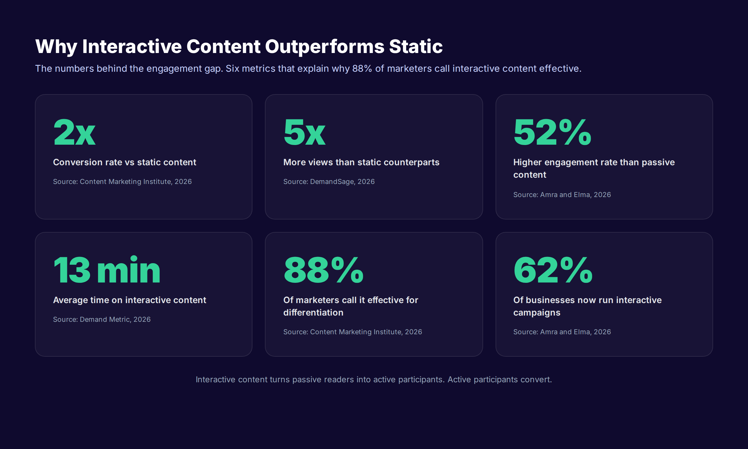
Interactive content generates 2x more conversions than static content and 5x more views, yet 38% of marketers still publish almost none of it. That gap is the cheapest competitive edge in content marketing right now.
Most brands publish blog posts, ebooks, and gated PDFs. The reader skims, scrolls, and leaves. Static formats earn 1.3 minutes of attention on average. Interactive formats earn 13. The format alone changes the math.
This interactive content guide covers what interactive content is, the 12 formats that actually move buyers, the tools to build each one, and the mistakes that quietly erode ROI. Every recommendation comes from production work, not theory.
We publish 3,500+ blogs across 70+ industries, and interactive layers sit inside many of those campaigns. We have watched quizzes outperform static lead magnets 4 to 1. We have also watched expensive interactive videos earn zero qualified leads when the funnel stage was wrong. Both lessons shape this guide.
Here is what you will learn:
- What interactive content is and why the format outperforms static
- The 12 interactive content types every marketing team should know
- Real examples from B2B, B2C, and local business campaigns
- How to map each format to a buyer journey stage
- The tools we use to build each format
- The 8 mistakes that kill interactive content ROI
- How to measure and refresh interactive assets
What Interactive Content Is
Interactive content is any digital asset that requires the reader to do something other than scroll. Click, drag, type, answer, swipe, configure, or play. The reader becomes a participant. The content responds.
A static blog post tells the reader something. An interactive piece asks the reader something, then changes based on the answer. That two-way exchange is the source of every performance gain.
The simplest test: if a reader closes the tab and the experience would have looked the same for everyone else who visited, it is not interactive. If the reader leaves with a personalized output, a score, a recommendation, or a saved state, it is.
Why The Format Outperforms Static
The performance gap is real and well-measured. Buyers spend an average of 8.5 minutes on static content and 13 minutes on interactive, according to Demand Metric benchmark data cited across industry research. Conversion rates double. Engagement rates climb 52%.
The reason is psychological, not technical. Active participation triggers commitment. A reader who answers five quiz questions has invested effort. That investment makes the recommendation at the end feel earned, not pushed. The same dynamic powers good sales conversations.
Content Marketing Institute reports that 88% of marketers say interactive content is effective at differentiating their brand. The number of businesses running interactive campaigns has nearly doubled in two years.
Where Interactive Content Fits In A Modern Stack
Interactive assets do not replace blog posts. They sit on top of them. A blog post pulls organic traffic. A quiz embedded inside that blog post converts the traffic.
Most teams already have the blog half handled. The interactive half is the missing layer. That is why this format has so much room to run. For a wider view of how interactive layers fit alongside other formats, see our content marketing examples guide.
The 12 Types of Interactive Content
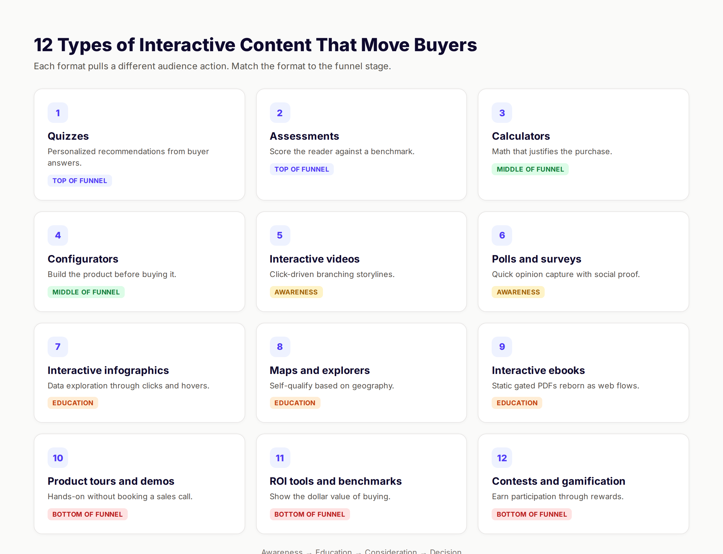
Different formats serve different jobs. A quiz works for awareness. A calculator works for consideration. A demo works for decision. Mixing them solves the whole funnel.
1. Quizzes
Quizzes ask 5 to 8 questions and serve a personalized result. The reader gets a category, a recommendation, or a score. The brand gets data about the reader.
Real example: Sephora's foundation finder asks about skin tone, finish preference, and coverage. The reader leaves with a matched product. Sephora leaves with a buyer profile worth more than any banner ad.
Quizzes work because they feel like a benefit, not a form. The reader thinks they are getting help. The brand collects 6 segmentation signals along the way. Build these with Outgrow, Typeform, or Interact.
2. Assessments
An assessment is a more serious cousin of a quiz. The output is a score, a maturity level, or a benchmark against peers. B2B audiences respond strongly to assessments because they answer the question "where do we stand?"
Real example: HubSpot's Website Grader scores a domain across performance, SEO, mobile, and security. Marketers run it before sales calls. HubSpot collects the lead and the website data simultaneously.
Assessments belong in the middle of the funnel. They convert because the score gives the reader a reason to talk to sales.
3. Calculators
Calculators do the math the reader does not want to do. Mortgage rates. ROI estimates. Cost savings. Energy bills. Anything where a buying decision depends on a number.
Real example: Salesforce publishes an ROI calculator that asks for company size, deal cycle length, and current conversion rate. It returns a projected revenue lift. That number lives in the prospect's next budget meeting.
Calculators are the highest-ROI format for B2B SaaS. Build them in Outgrow or as a native React component on the marketing site. Tie the result to a call-to-action: "See your ROI in detail with a 30-minute strategy call."
4. Configurators And Builders
A configurator lets the reader build the product before buying it. Choose options. Stack add-ons. See the price update in real time. The end state feels like ownership.
Real example: Tesla's car configurator lets buyers pick paint, wheels, interior, and self-driving package. The total updates instantly. Many buyers configure a car they never order, but the data tells Tesla which trims to manufacture next.
E-commerce brands selling complex SKUs gain the most. Furniture, computers, kitchens, and bikes all benefit. The cost to build is higher than a quiz, but the conversion impact is bigger.
5. Interactive Videos
Interactive videos add clickable hotspots, branching storylines, and embedded questions. The viewer chooses what happens next. The brand watches which paths get the most clicks.
Real example: Maybelline used an interactive product tutorial that let viewers click on lip colors. Each click jumped to a product page. The video became a shoppable catalog.
Interactive video is the single best format for storytelling brands. Nearly 90% of marketers report sales growth after adding interactive video, according to industry benchmarks. Build them in Mindstamp, HapYak, or Vidyard.
6. Polls And Surveys
Polls are the lightweight version of quizzes. One question, one click, a public result. They show up on social, blogs, and emails. They are cheap, fast, and viral when written well.
Real example: LinkedIn polls regularly outperform link posts by 3 to 5x in engagement. A B2B SaaS that asks "How many tools does your stack include?" earns 10x the impressions of a regular post.
Polls work because they are low-friction. One tap and the reader is done. The aggregated data also feeds the next blog post. We use polls inside our own newsletter to crowdsource topics.
7. Interactive Infographics
Interactive infographics let readers click, hover, and zoom into data. A static infographic gives the same message to every viewer. An interactive one lets readers explore.
Real example: The New York Times publishes interactive maps that show election results by county. Click a county to see vote totals. The same dataset would be unreadable as a static image.
Build these with Ceros, Shorthand, or D3.js. Use them when the underlying data is genuinely complex. A simple bar chart does not need interactivity.
8. Maps And Geo Explorers
Interactive maps let readers self-qualify by geography. Service area maps. Store locators. Coverage maps. Delivery zones. Pricing by region.
Real example: Zillow's home value map lets buyers filter by price, bedrooms, and school district. The map updates as they zoom. That experience is the entire product.
Local businesses gain the most from this format. A roofing company that publishes an interactive service area map captures more local leads than one that lists ZIP codes. For more on local visibility, see our local SEO module.
9. Interactive Ebooks And Long-Form Stories
Interactive ebooks replace the gated PDF. Instead of a download, the reader gets a scrolling page with embedded videos, animations, and quizzes. The brand keeps the reader on-site and collects behavioral data.
Real example: Typeform's "Get Real" report surveyed 1,300 marketers, then published the findings as an interactive scrollytelling page. The page outperformed the gated PDF version on every metric: time on page, social shares, and qualified leads.
Build these in Shorthand or as native code. The format works best when the content is genuinely worth 10+ minutes of attention.
10. Product Tours And Interactive Demos
Product tours let prospects use the product without booking a call. Click around the real interface. Walk through the workflow. See the value firsthand.
Real example: Notion's homepage includes a live preview of a real Notion workspace. Visitors can type, drag, and explore without signing up. Pipedrive, Linear, and Webflow do the same. Each shaved their sales cycle by 30 to 50%.
For SaaS companies, the interactive demo is the most important asset on the site. Build with Navattic, Storylane, or Arcade. Place it on the homepage and on every comparison page.
11. ROI Tools And Cost Builders
ROI tools are calculators with a sales motive. They estimate dollar value, time saved, or risk avoided. They give the prospect ammunition for an internal pitch.
Real example: Klaviyo's revenue forecast tool asks for current email subscribers and average order value. It returns a projected revenue lift from email marketing. Marketers paste that number into their boss's deck.
These work because they make the buying decision easier inside the prospect's company, not just for the prospect. That is a critical detail.
12. Contests And Gamification
Contests use rewards to drive participation. Earn points. Climb a leaderboard. Unlock badges. Win a prize. The mechanics borrow from video games.
Real example: Duolingo's daily streak is gamification at its purest. Users return every day to keep a number alive. The same psychology works for B2B onboarding flows and loyalty programs.
This format works for retention more than acquisition. Use it after the customer is already in. For an adjacent take on engagement formats, see our guide to social media content ideas.
Mapping Interactive Content To The Buyer Journey
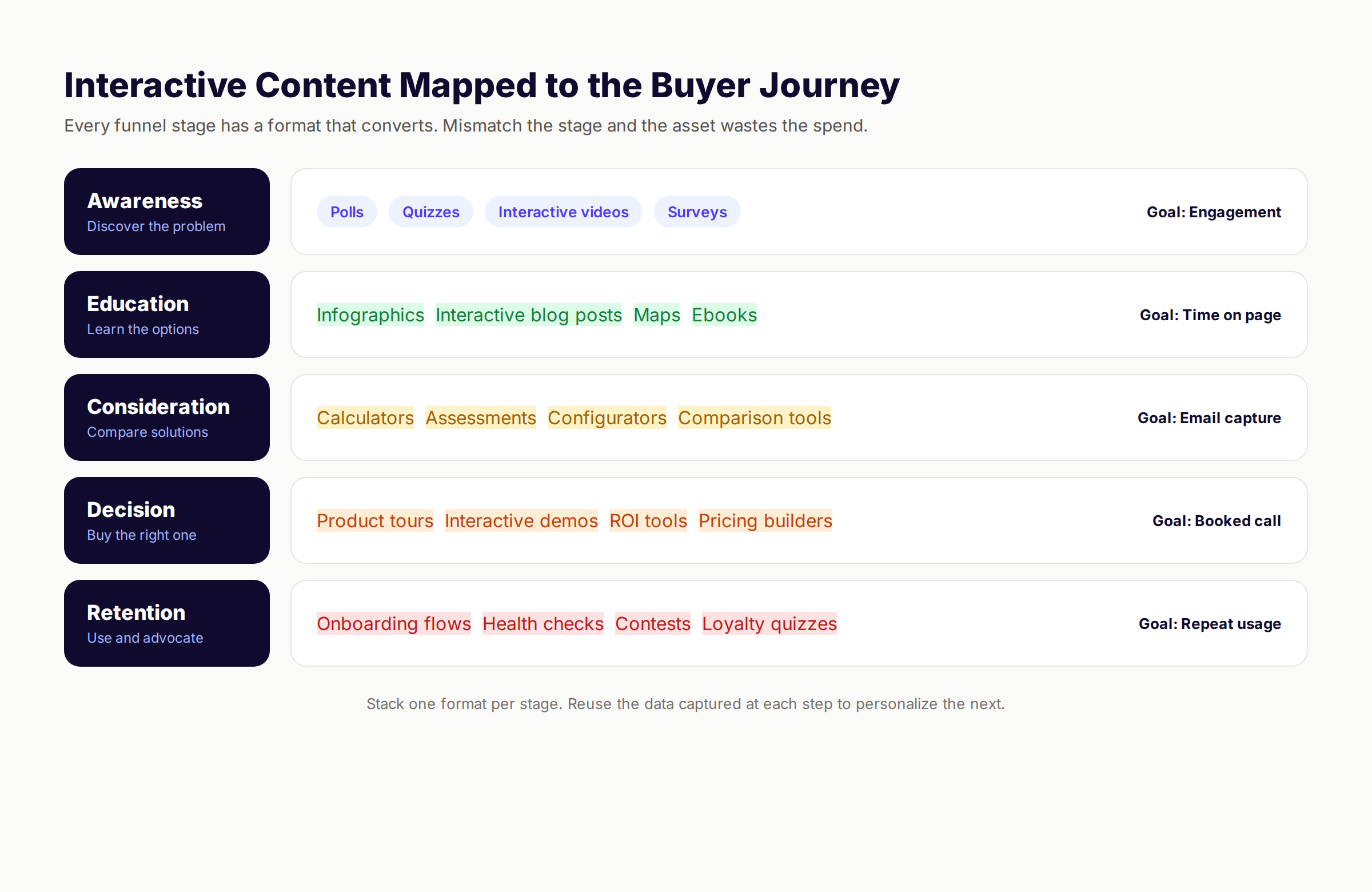
The biggest mistake teams make is treating interactive content as a single category. It is not. Each format pulls a specific audience action at a specific funnel stage.
Awareness Stage
The reader does not know they have the problem yet. The job of the asset is to attract attention and start the conversation. Quizzes, polls, and short interactive videos do this best.
Goal: Engagement and social reach. Examples: "Which marketing personality are you?" quiz. "What is your team's content maturity?" poll. Track: Impressions, completion rate, social shares.
Education Stage
The reader knows the problem and wants to understand it. They are not ready to buy. Interactive infographics, scrollytelling stories, and explorers fit here.
Goal: Time on site and trust building. Examples: Interactive industry report. Annotated benchmark map. Animated explainer. Track: Average time on page, scroll depth, pages per session.
Consideration Stage
The reader is comparing solutions. They want to know which one fits them. Calculators, assessments, and comparison tools do the heavy lifting.
Goal: Email capture and lead qualification. Examples: ROI calculator. Vendor fit assessment. Pricing builder. Track: Form completions, lead score, MQL rate.
Decision Stage
The reader is ready to buy but needs to validate. Interactive demos, product tours, and configurators close the gap.
Goal: Booked sales calls and self-serve signups. Examples: Interactive product tour. Configurator. Personalized demo. Track: Demo bookings, signup rate, time to first session.
Retention Stage
The customer is in. The job is to deepen usage. Gamified onboarding, health checks, and loyalty quizzes work here.
Goal: Repeat usage and expansion revenue. Examples: Onboarding flow with progress bar. Quarterly health assessment. Loyalty tier quiz. Track: Active days, expansion MRR, NPS.
Your SEO team. $99 per month. We publish 30 optimized articles every month and embed interactive layers when the format earns the lift.
Static vs Interactive Content: The Performance Gap
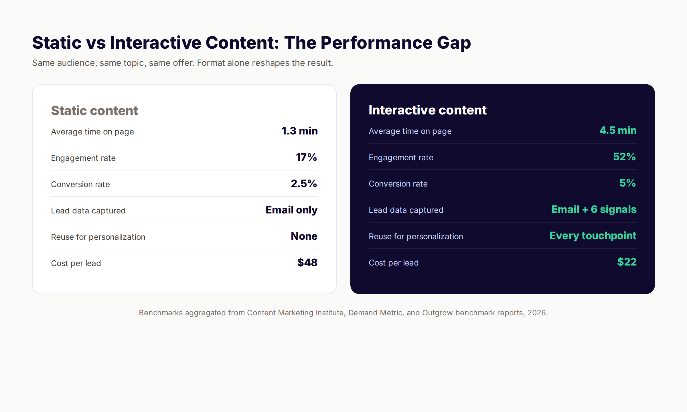
The case for interactive is not theoretical. It shows up in every benchmark study published in the last three years. Same audience, same offer, different format. The numbers tell the story.
The Numbers In One Table
| Metric | Static content | Interactive content |
|---|---|---|
| Average time on page | 1.3 minutes | 4.5 minutes |
| Engagement rate | 17% | 52% |
| Conversion rate | 2.5% | 5% |
| Lead data captured | Email only | Email plus 6 signals |
| Reuse for personalization | None | Every touchpoint |
| Social shareability | Low | High |
| Cost per qualified lead | $48 | $22 |
Sources: Content Marketing Institute, Demand Metric, and Outgrow benchmark reports, 2026.
Why Interactive Wins Every Column
Time on page. A reader has to engage to progress. The format itself extends attention.
Engagement rate. Clicking, dragging, and typing are measurable actions. Static reading is not.
Conversion rate. Personalized recommendations convert better than generic ones. Interactive assets earn the personalization.
Data captured. Quiz answers reveal interests. Calculator inputs reveal company size. Configurator selections reveal preferences. The lead form on a static page captures only an email.
Cost per lead. The conversion rate lift offsets the higher build cost. Most assets break even inside 60 days.
For a deeper look at content ROI math, see our guide on how to measure content marketing ROI.
5 Steps to Ship Interactive Content That Converts
Most failed interactive projects fail in the planning stage, not the build stage. The fix is a repeatable process. We use this five-step framework across every client engagement.
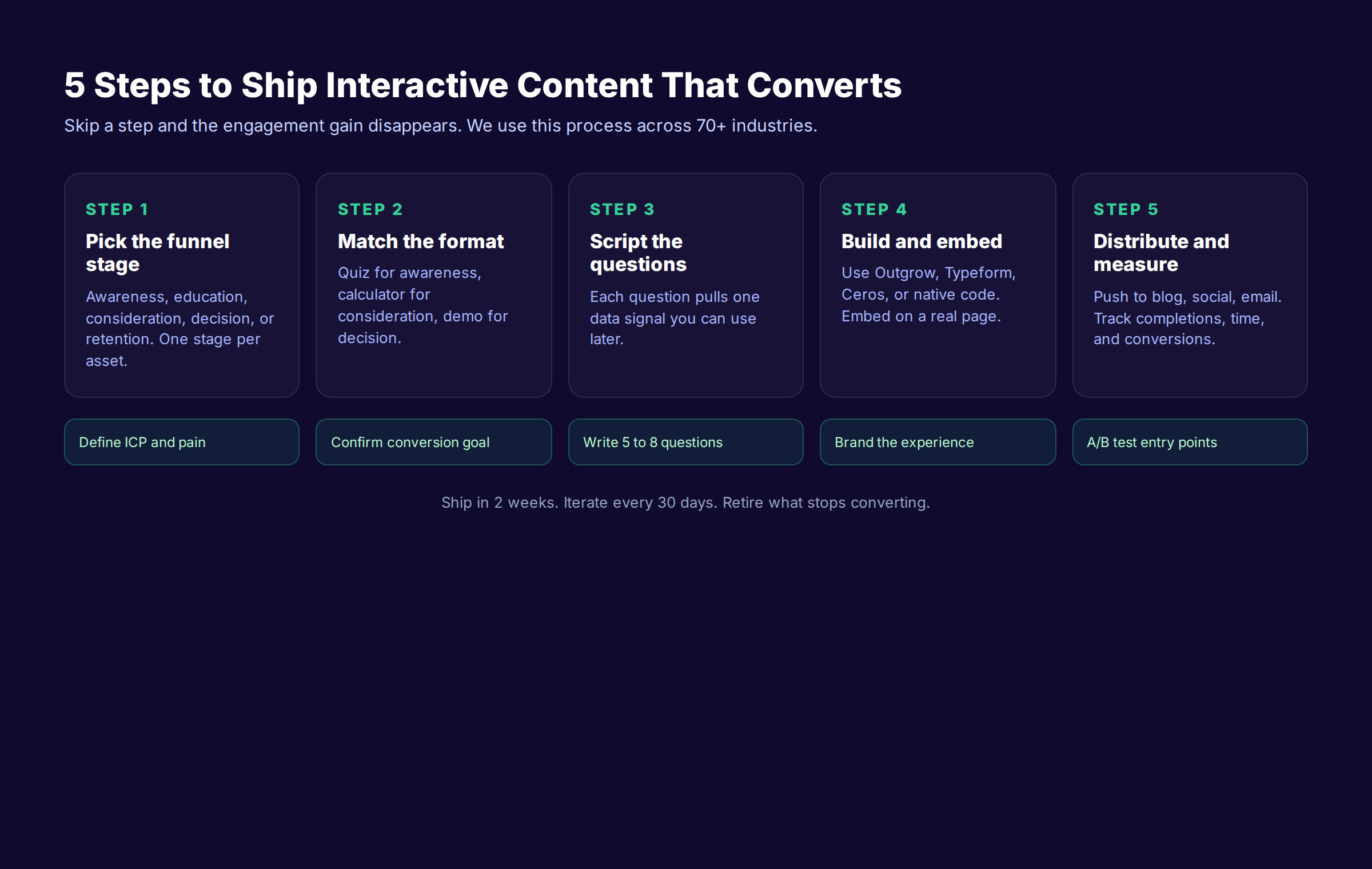
Step 1: Pick The Funnel Stage
Choose one. Awareness, education, consideration, decision, or retention. Trying to serve two stages with one asset is the number one reason interactive content underperforms.
A quiz built for awareness needs to be light, viral, and sharable. A quiz built for consideration needs to be substantive, data-rich, and closely tied to a sales call. They cannot be the same quiz.
Step 2: Match The Format
Use the funnel map from earlier. If the stage is awareness, build a quiz, poll, or short interactive video. If the stage is consideration, build a calculator or assessment. The format follows the stage.
Resist the urge to build the format you find exciting. Build the format the funnel needs.
Step 3: Script The Questions
Every question should pull one data signal you can use later. Company size, role, pain point, timeline, budget, current tool stack. Five to seven questions is the sweet spot. More than eight cuts completion rates in half.
Write the result page first. Then reverse-engineer the questions that produce it. This forces every question to earn its place.
Step 4: Build And Embed
Pick the tool. Build the asset. Brand it. Test it on mobile. Then embed it on a real page that already gets traffic.
The number one reason interactive assets fail is being parked on a standalone landing page with no traffic. The fix is embedding inside existing blog posts, on the homepage, and in email sequences.
Step 5: Distribute And Measure
Push the asset everywhere. Blog. Social. Email. Paid. Sales decks. Set up tracking from the first interaction through the last conversion. Measure weekly for the first month, then monthly.
For a broader process view, see our guide on content marketing strategy.
The Tools To Build Each Format
Tool choice depends on three things: which format you need, what your team can manage, and what you can afford. The good news is that every format has a tool starting under $30 per month.
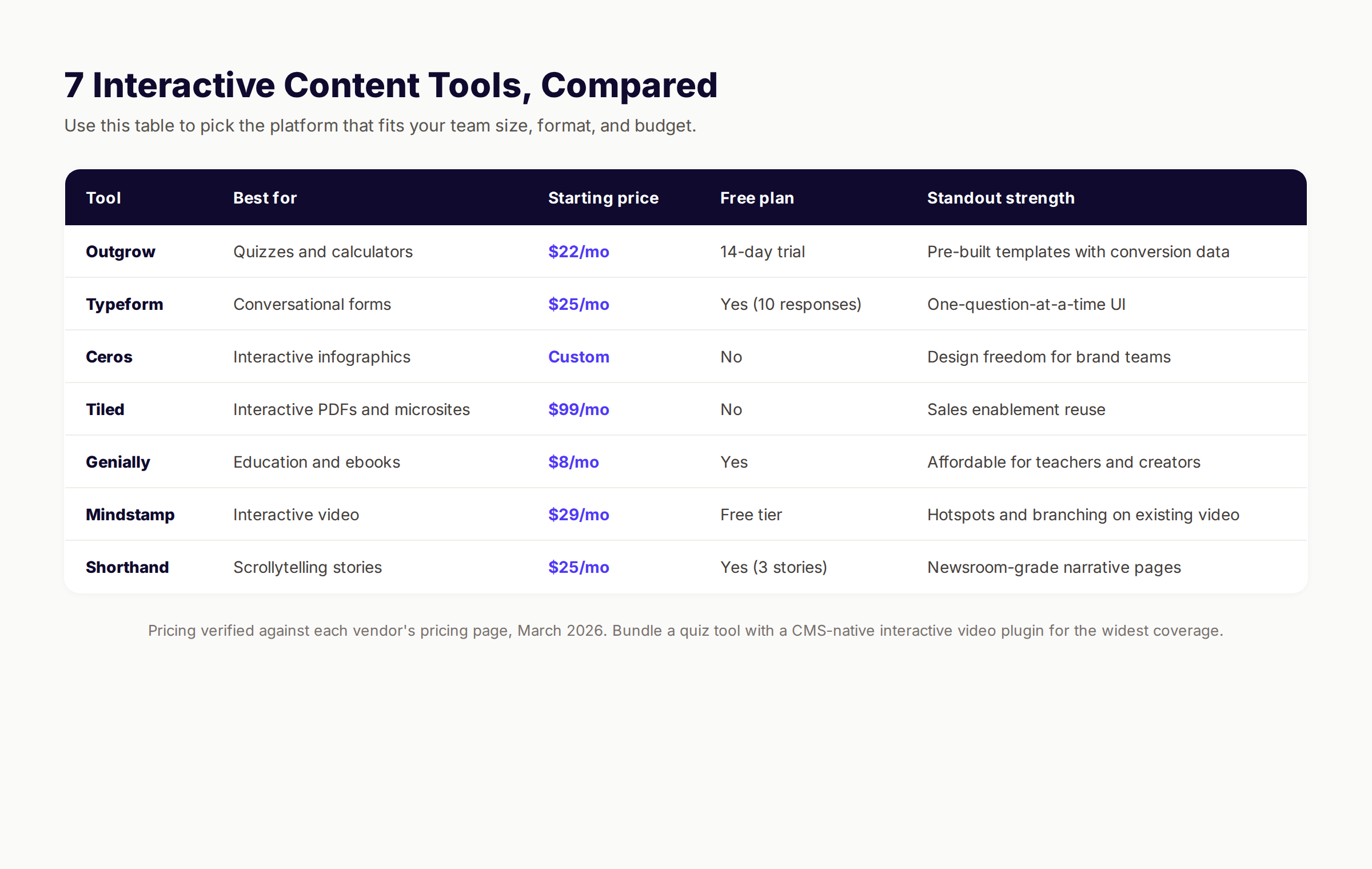
The 7 Tools We See Most Often
| Tool | Best for | Starting price | Free plan | Standout strength |
|---|---|---|---|---|
| Outgrow | Quizzes and calculators | $22/mo | 14-day trial | Pre-built templates with conversion data |
| Typeform | Conversational forms | $25/mo | Yes (10 responses) | One-question-at-a-time UI |
| Ceros | Interactive infographics | Custom | No | Design freedom for brand teams |
| Tiled | Interactive PDFs and microsites | $99/mo | No | Sales enablement reuse |
| Genially | Education and ebooks | $8/mo | Yes | Affordable for teachers and creators |
| Mindstamp | Interactive video | $29/mo | Free tier | Hotspots and branching on existing video |
| Shorthand | Scrollytelling stories | $25/mo | Yes (3 stories) | Newsroom-grade narrative pages |
Pricing verified against each vendor's pricing page, March 2026.
How To Pick
If you need a quiz or calculator, start with Outgrow. The template library cuts build time from days to hours.
If you need a conversational form or assessment, use Typeform. The one-question-at-a-time format pulls higher completion rates than traditional forms.
If you need interactive video, use Mindstamp. It works on top of video you already have. No reshoots required.
If you need a long-form story or scrollytelling page, use Shorthand. The format is built for editorial teams.
If you need a configurator or shoppable experience, build native. Off-the-shelf tools rarely match the brand and conversion needs of e-commerce.
For a wider comparison of content tools, see our roundup of the best content optimization tools.
Real-World Examples By Industry
The format-to-stage map is universal. The specific implementation depends on the industry. Here is what works where.
SaaS
The winning combination is an ROI calculator at the top of the homepage and an interactive product tour on the product page. Klaviyo, HubSpot, and Notion all run this playbook. The calculator pulls leads. The tour converts them.
E-commerce
Quizzes and configurators dominate. Beauty brands run shade finders. Furniture brands run room planners. Bike brands run fit guides. Every quiz becomes a personalized PDP at the end.
For Shopify-specific implementations, see our Shopify SEO guide.
B2B Services
Assessments and ROI calculators do the heaviest lifting. A marketing agency runs a "content maturity assessment." A consulting firm runs a "digital transformation readiness score." The output is a personalized report and a booked discovery call.
Local Businesses
Interactive maps, service area finders, and instant quote tools convert local searchers fastest. A plumber that shows a 30-second quote calculator on the homepage outperforms one that says "call for a quote." See our local business marketing plan for adjacent tactics.
Education And Nonprofits
Interactive ebooks, gamified lessons, and donation calculators outperform static counterparts. Khan Academy, Duolingo, and charity:water all built their growth engines around interactive learning and giving formats.
Publishers And Media
Scrollytelling stories, interactive data visualizations, and polls drive subscription conversions. The New York Times, The Pudding, and FiveThirtyEight all rely on interactive features to keep readers on-site longer.
8 Mistakes That Kill Interactive Content ROI
Every team we have advised has made at least three of these mistakes. The mistakes are predictable. The fixes are predictable too.
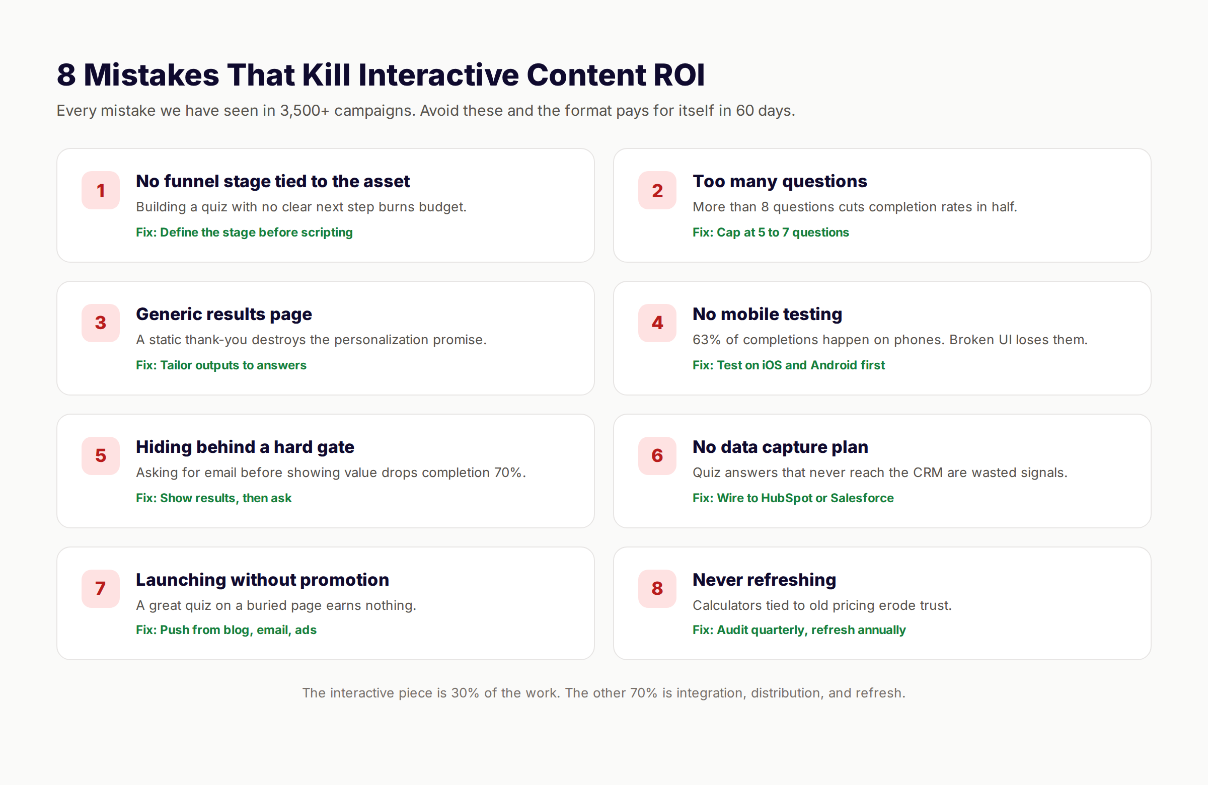
1. No Funnel Stage Tied To The Asset
The team builds a quiz because quizzes are trendy. There is no plan for what happens after the quiz ends. The asset converts nothing because nothing was set up to convert.
Fix: Define the funnel stage and the next action before scripting a single question.
2. Too Many Questions
A 15-question quiz feels thorough to the team that built it. To the reader, it feels like a tax return. Completion rates drop below 30% past 8 questions.
Fix: Cap at 5 to 7 questions. If more data is needed, capture it after the conversion event.
3. Generic Results Page
The reader answers 6 questions and lands on a generic thank-you page. The personalization promise is broken. The conversion follows.
Fix: Tailor the results page to the answers. Show recommendations, scores, and product matches that reflect what the reader said.
4. No Mobile Testing
63% of interactive completions happen on phones. A desktop-only experience loses two-thirds of the audience before the first question.
Fix: Test on iOS and Android first. Build desktop as the enhancement, not the default.
5. Hiding Behind A Hard Gate
Asking for an email before showing any value drops completion rates by 70%. The reader has not earned the right to ask for trust yet.
Fix: Show the result first, then ask for the email to unlock the deeper analysis.
6. No Data Capture Plan
Quiz answers that never reach the CRM are wasted signals. The marketing team has the data. The sales team has none of it. Personalization at scale fails.
Fix: Wire the asset to HubSpot, Salesforce, or whatever CRM the team uses. Map each answer to a contact property.
7. Launching Without Promotion
The team ships the asset to a standalone page and waits. The traffic never arrives because there is no distribution plan.
Fix: Embed inside existing blog posts. Push from email. Run paid ads. Add to sales decks. Treat distribution as 70% of the work.
8. Never Refreshing
A calculator tied to 2024 pricing erodes trust by 2026. An assessment with outdated questions feels stale. The asset stops converting.
Fix: Audit every interactive asset quarterly. Refresh annually. Retire what no longer converts.
For more on keeping content fresh, see our guide to content decay and how to fix it.
How To Measure Interactive Content
Measuring interactive content is harder than measuring blog posts. Pageviews tell only a small part of the story. The metrics that matter are deeper.
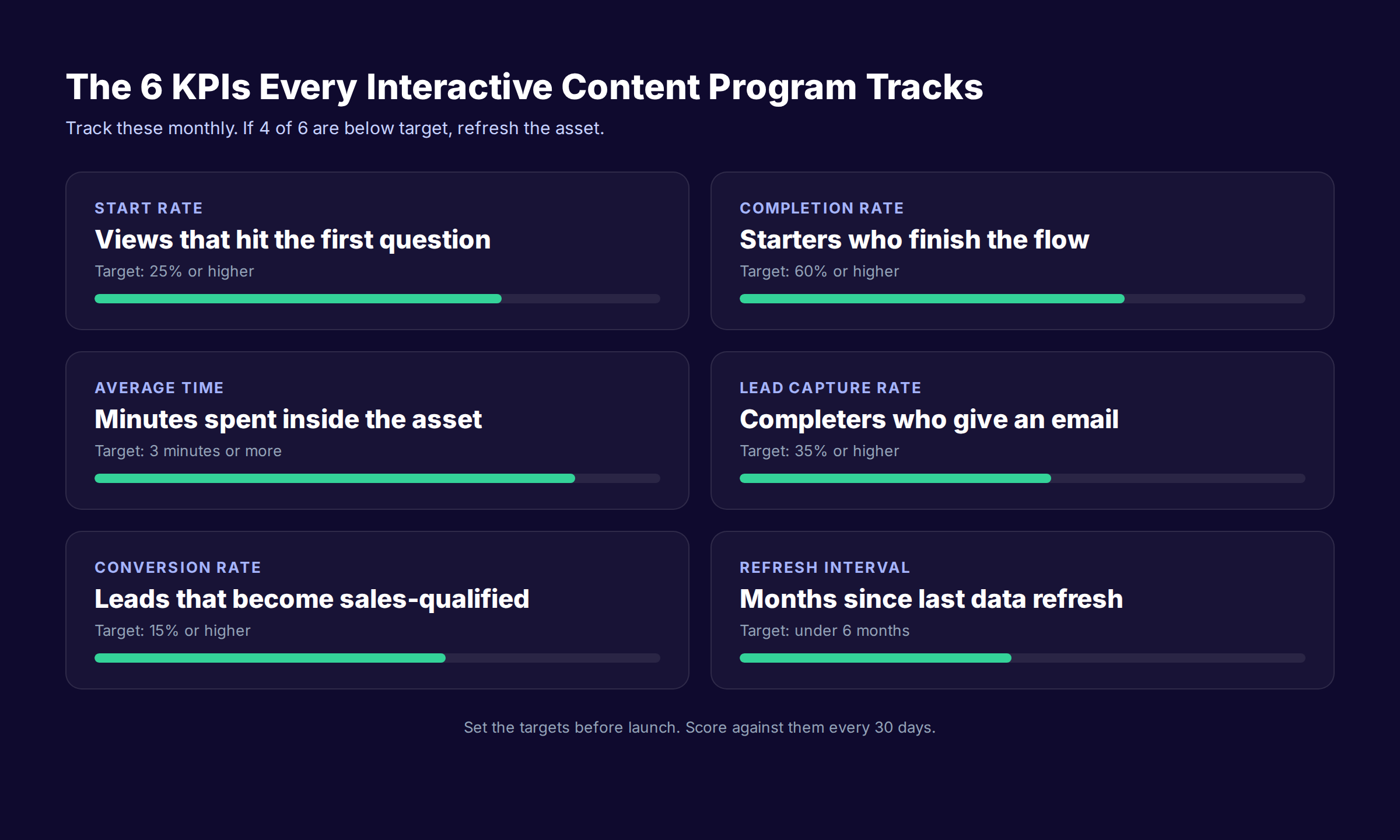
The 6 KPIs Every Program Tracks
| KPI | What it measures | Target |
|---|---|---|
| Start rate | Views that hit the first question | 25% or higher |
| Completion rate | Starters who finish the flow | 60% or higher |
| Average time | Minutes spent inside the asset | 3 minutes or more |
| Lead capture rate | Completers who give an email | 35% or higher |
| Conversion rate | Leads that become sales-qualified | 15% or higher |
| Refresh interval | Months since last data refresh | Under 6 months |
How To Use The Targets
Set the targets before launch, not after. Score against them every 30 days. If 4 of 6 are below target, the asset needs work. The most common fixes: shorten the flow, sharpen the result page, or push more traffic.
Attribution Beyond The First Conversion
The first conversion is the easy part. The harder part is tracking what happens after. Did the lead become an opportunity? Did the opportunity close? Did the customer expand?
Wire the data to the CRM with a clear UTM and source field. Track the cohort over 90 days. Compare against leads who came through static content. The lift in long-term value is usually 2 to 3x.
For deeper measurement tactics, see our SEO reporting guide.
How Interactive Content Plugs Into An SEO Strategy
Interactive content alone does not earn traffic. SEO does. The two formats complement each other. Static content pulls the reader. Interactive content converts the reader.
The Stack That Works
- Publish a blog post that ranks for a high-intent keyword.
- Embed an interactive asset inside the post that matches the funnel stage.
- The post earns the click. The asset earns the conversion.
- The conversion data flows to the CRM and sales.
This is the model we run for clients. Blog SEO pulls 70% of the traffic. The interactive layer converts 5 to 10% of that traffic instead of the 0.5 to 1% a plain blog post would.
Why Interactive Boosts SEO Indirectly
Google does not rank interactive content higher by default. But three indirect signals matter:
- Time on page. Interactive content extends sessions, and Google reads dwell time as a relevance signal.
- Link earning. Interactive assets get linked from other sites at 4x the rate of static posts.
- Brand search. Memorable interactive experiences drive branded queries weeks later.
For more on the SEO foundations, see our SEO content writing guide and the SEO content brief template.
What practitioners are saying on X
AI search advice ages quickly. Here is high-signal public discussion from SEO and growth operators — context for your roadmap, not a substitute for primary data.
- @varunram (Jul 2026): Critique of GEO slopfarm products that combine SEO clickbait with unresearched content marketing — quality and research still separate winners from farms. See the post on X.
- @jakezward (Feb 2026): 2026 SEO predictions emphasize AI Overview share-of-SERP, schema for LLM token efficiency, brand mentions in AI answers as a KPI, proprietary data as a moat, and content refresh beating net-new AI slop. See the post on X.
- @HlynurStefDev (Jul 2026): Public case: niche site traffic jumped from ~18 to 4,162 Google visits/month after focused technical/on-page SEO work (GSC screenshots claimed) — reminds that fundamentals still move numbers. See the post on X.
Grok, AI Overviews, and multi-engine visibility
Content topics like “interactive content guide” get AI citations when process steps, quality bars, and examples are concrete. Operator consensus on X is clear: research-backed pages beat unedited bulk generation — reflect that honestly.
- Google AI Overviews: Use passage-ready answers, tables, and FAQ schema where relevant.
- ChatGPT / Perplexity: Cite named sources next to key claims.
- Grok: Maintain accurate entity facts on-site and in high-signal X posts.
Publish content built for Google and AI citations. theStacc’s Content SEO module ships SEO-scored articles structured for rankings and generative engines — including clearer entity pages models like Grok can quote.
Frequently Asked Questions
The most commonly cited 15 include quizzes, assessments, calculators, configurators, interactive videos, polls, surveys, interactive infographics, maps, interactive ebooks, product tours, demos, ROI tools, contests, and gamified onboarding flows. Most teams should focus on 3 to 5 formats that match their funnel rather than building all 15.
Real examples include Sephora's foundation finder quiz, HubSpot's Website Grader assessment, Salesforce's ROI calculator, Tesla's car configurator, Maybelline's interactive tutorials, The New York Times's election maps, Notion's live product preview, and Duolingo's gamified streaks. Each one earns more time, data, and conversions than its static equivalent.
The five C's are Clear, Concise, Compelling, Credible, and Conversion-focused. Interactive content respects all five because the format forces clarity (the reader must understand each step), compels participation (the reader must act), builds credibility (personalized results show the brand listened), and ties every interaction to a conversion goal.
The 70 20 10 rule says 70% of content should be proven and reliable, 20% should test new formats, and 10% should be experimental. Interactive content typically lives in the 20% tier when a team is starting out and graduates to the 70% tier once formats prove their ROI. We see this transition take 6 to 9 months at most companies.
The 3 3 3 rule says a piece of content should grab attention in 3 seconds, hold it for 3 minutes, and deliver one clear action within 3 clicks. Interactive content hits this rule by design. The first question pulls the reader in. The middle questions hold them. The result page delivers the action.
The optimal range is 2 to 5 minutes. Under 2 minutes feels thin and the personalization weakens. Over 5 minutes and completion rates drop. Quizzes and polls land in the 2 to 3 minute range. Calculators, assessments, and configurators run 3 to 5 minutes. Interactive videos and ebooks can run longer if the storytelling earns the time.
Most formats cost between $0 and $5,000 to build using off-the-shelf tools. A quiz built in Outgrow costs the monthly subscription plus 6 to 10 hours of marketing time. A custom configurator costs $20,000 to $100,000 in development. Most teams start with the cheap formats and graduate to custom builds only after the ROI is proven.
Indirectly yes. Interactive assets do not rank higher than static pages by default. But they extend time on page, attract more backlinks, and drive branded searches. All three feed Google's quality signals. The post that ranks number one is rarely the one with the best keywords. It is often the one that keeps readers engaged the longest.
The Bottom Line
Interactive content is the cheapest competitive edge in content marketing right now. The formats are proven. The tools are accessible. The performance gap is real and measurable.
Most brands still publish only static content. The ones that mix in interactive layers earn 2x the conversions, 5x the views, and a fraction of the cost per qualified lead. The math is not subtle.
Start with one format that fits one funnel stage. A quiz for awareness. A calculator for consideration. A demo for decision. Ship it inside a blog post that already gets traffic. Measure for 30 days. Then add the next format.
If publishing the underlying blog content is the bottleneck, that is where we come in. We publish 30 SEO articles per month for $99, and the interactive layers slot in cleanly on top.
See your first articles in 3 days
This article was researched and published by theStacc, the same platform businesses use to publish SEO content automatically. We use interactive layers across our own client work and the formats reviewed above are all in active production. All pricing and benchmarks were verified against public sources as of March 2026.
Related Reading
- Content Marketing Examples
- Content Marketing Statistics
- Content Marketing Strategy
- SEO Content Writing Guide
- How to Measure Content Marketing ROI
- Social Media Content Ideas
Related Tools & Resources
Free SEO Tools:
Best Lists:
Sources & references
- [1] Princeton / Georgia Tech et al. — GEO research (arXiv:2311.09735)
- [2] @varunram on X — Critique of GEO slopfarm products that combine SEO clickbait with unresearched content marketing — quality and research
- [3] @jakezward on X — 2026 SEO predictions emphasize AI Overview share-of-SERP, schema for LLM token efficiency, brand mentions in AI answers
- [4] @HlynurStefDev on X — Public case: niche site traffic jumped from ~18 to 4,162 Google visits/month after focused technical/on-page SEO work (G
- [5] Referenced source — www.demandmetric.com

Plan topics, review article drafts, and publish to a connected CMS.
Weekly local SEO teardowns
One practical email a week. Map Pack, GBP, AI Overviews. No fluff. Unsubscribe anytime.