Mobile SEO (2026): Strategies, Tactics & Examples
Practical mobile seo guide strategies for 2026: step-by-step tactics, real examples, and tools to improve rankings and drive organic traffic.
Your site gets more mobile traffic than desktop traffic. That is not a trend. It is a fact.
58% of all Google searches happen on a smartphone. Google uses your mobile site. Not your desktop site. As the version it indexes and ranks. If your mobile experience is slow, broken, or incomplete, your rankings suffer across every device.
This guide covers everything you need to know about mobile SEO in 2026. We publish 3,500+ blog posts across 70+ industries and optimize every single one for mobile-first indexing before it goes live.
Here is what you will learn:
- What mobile SEO means and why Google made it non-negotiable
- How mobile-first indexing works (and what Google actually crawls)
- Which site configuration Google recommends
- How to fix mobile page speed problems that kill rankings
- The UX signals that affect your mobile search performance
- How to maintain content parity between desktop and mobile
- The exact tools to test and audit your mobile SEO
- The 8 most common mobile SEO mistakes (and how to fix each one)
What Is Mobile SEO
Mobile SEO is the practice of optimizing your website for users on smartphones and tablets. It covers page speed, responsive design, tap targets, viewport settings, and content structure. The goal is simple: make your site fast, readable, and usable on a small screen.
Why Mobile SEO Matters More Than Ever
Over 60% of global web traffic comes from mobile devices. Google confirmed in 2024 that mobile-first indexing is now the universal default for 100% of websites. No exceptions remain.
That means Google’s crawler sees your mobile site first. If your mobile version is missing content, loads slowly, or breaks on small screens, your desktop rankings drop too.
Mobile SEO vs. Desktop SEO
Desktop SEO and mobile SEO share the same fundamentals: keyword targeting, quality content, on-page SEO, backlinks, and technical SEO. The difference is in execution.
| Factor | Desktop | Mobile |
|---|---|---|
| Screen width | 1200-1920px | 320-428px |
| Input method | Mouse + keyboard | Touch (thumb zone) |
| Avg load time | 2.5 seconds | 8.6 seconds |
| Viewport | Fixed | Requires meta tag |
| Navigation | Hover menus | Hamburger + tap |
The average mobile page loads 3.4 times slower than desktop. That gap makes mobile page speed a ranking factor you cannot ignore.
Mobile-First Indexing Explained
Mobile-first indexing means Google uses the mobile version of your website as the primary version for crawling, indexing, and ranking. Google announced this shift in 2016 and completed the rollout in July 2024.
What Google Actually Crawls
Googlebot now crawls with a smartphone user agent by default. It sees your mobile HTML, your mobile CSS, and your mobile JavaScript rendering. If content exists only on your desktop version, Google may never see it.
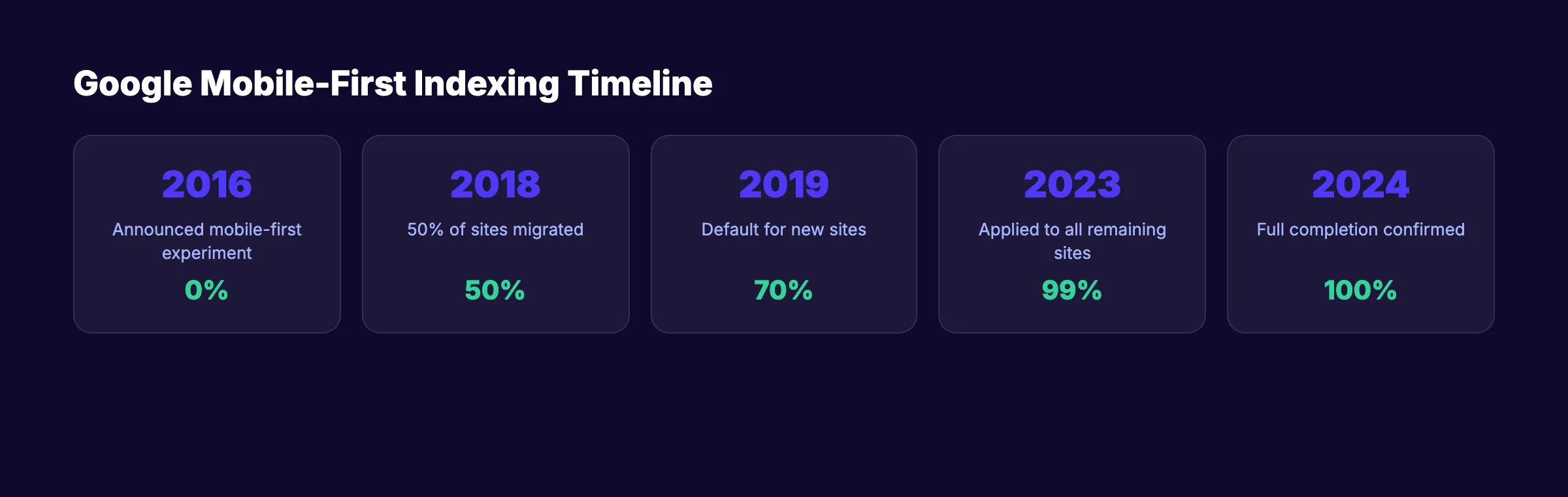
The Timeline of Mobile-First Indexing
| Year | Milestone |
|---|---|
| 2016 | Google announces mobile-first indexing experiment |
| 2018 | 50% of sites migrated to mobile-first indexing |
| 2019 | Mobile-first indexing becomes default for new sites |
| 2023 | Google applies mobile-first indexing to all remaining sites |
| 2024 | Full completion confirmed. Zero desktop-only exceptions |
What This Means for Your Site
Check Google Search Console to see which Googlebot version crawls your pages. Under Settings, look for the “Crawler” section. It should show “Smartphone.”
If your mobile site hides content behind tabs, loads key sections only after user interaction, or uses different URLs without proper canonicalization, you are losing indexable content.
Your SEO should run on autopilot. Stacc publishes 30 SEO-optimized articles per month. Every one is built for mobile-first indexing. Start for $1 →
Responsive Design vs. Other Approaches
Google recommends responsive web design as the preferred configuration for mobile sites. But it is not the only option. There are 3 approaches to serving mobile content.
Responsive Web Design (Recommended)
Responsive design serves the same HTML and URL to every device. CSS media queries adjust the layout based on screen width. One URL. One codebase. One version for Google to crawl.
The viewport meta tag is required:
<meta name="viewport" content="width=device-width, initial-scale=1">Dynamic Serving
Dynamic serving uses the same URL but serves different HTML based on the user agent. This approach requires a Vary: User-Agent HTTP header so Google knows different content exists for different devices.
Separate Mobile URLs (m.example.com)
This older approach uses a separate subdomain for mobile. Google supports this but does not recommend it. Separate URLs create duplicate content risk, split link equity, and double your maintenance burden.
Which Should You Choose
| Approach | Google Preference | Maintenance | Content Parity Risk |
|---|---|---|---|
| Responsive | Recommended | Low | None |
| Dynamic Serving | Supported | Medium | Medium |
| Separate URLs | Supported | High | High |
Choose responsive design unless you have a specific technical reason not to.
Mobile Page Speed Optimization
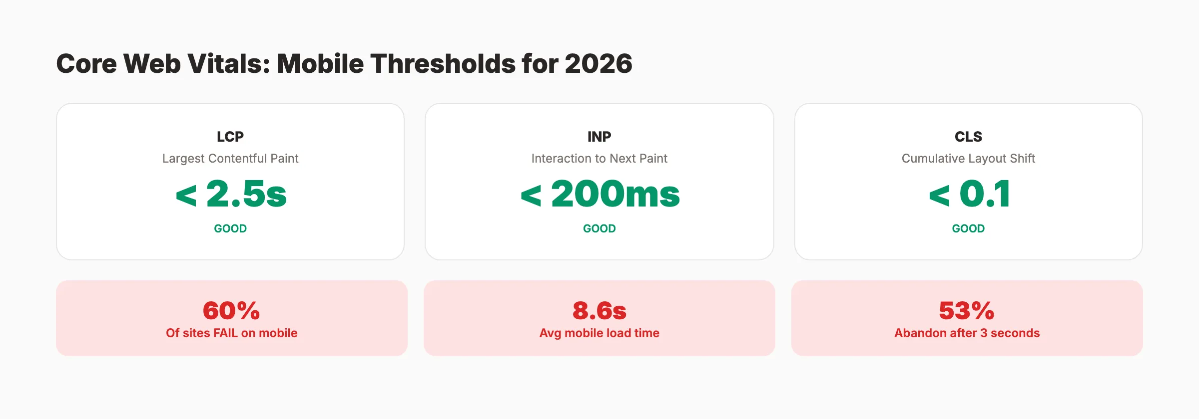
53% of mobile users abandon a site that takes longer than 3 seconds to load. The average mobile page takes 8.6 seconds. That gap costs rankings and revenue.
Core Web Vitals on Mobile
Core Web Vitals are Google’s metrics for measuring real-world user experience. Only 40% of websites pass all 3 thresholds on mobile.
| Metric | What It Measures | Good Threshold |
|---|---|---|
| LCP (Largest Contentful Paint) | Main content load time | Under 2.5 seconds |
| INP (Interaction to Next Paint) | Response to user input | Under 200ms |
| CLS (Cumulative Layout Shift) | Visual stability | Under 0.1 |
Speed Optimization Checklist
- Compress images to WebP format (image optimization guide)
- Enable browser caching with proper
Cache-Controlheaders - Minify CSS, JavaScript, and HTML
- Defer non-critical JavaScript with
deferorasyncattributes - Use a CDN for static assets
- Eliminate render-blocking resources above the fold
- Implement lazy loading for images below the fold
- Reduce server response time to under 1.3 seconds
Quick Wins for Mobile Speed
Reduce image file sizes. Images account for the largest share of page weight. Convert to WebP. Set explicit width and height attributes:
<img src="hero.webp" width="800" height="450" alt="Mobile SEO guide" loading="lazy">Preload critical resources. Tell the browser to fetch your LCP image early:
<link rel="preload" as="image" href="/hero-mobile.webp">A 0.1-second improvement in load time can increase conversions by 8.4% for retail sites. Speed is not just an SEO factor. It is a revenue factor.
Stop losing traffic to slow pages. Stacc handles your content publishing so you can focus on site performance. 30 articles a month, optimized and published. Start for $1 →
Mobile UX Signals That Affect Rankings
Google does not rank pages based on a single UX metric. But mobile user experience influences engagement, bounce rates, and dwell time. All of these feed back into rankings.
Tap Targets and Touch Accessibility
Google recommends a minimum tap target size of 48x48 CSS pixels with at least 8 pixels of spacing between targets. Check your tap targets in Google Search Console under the Mobile Usability report.
Font Size and Readability
Use a minimum base font size of 16px on mobile. Anything smaller forces users to pinch-to-zoom.
body {
  font-size: 16px;
  line-height: 1.5;
}
Intrusive Interstitials
Google penalizes pages that show full-screen popups on mobile, especially when they cover content immediately after a user taps through from search. Avoid full-screen overlays, popups that require dismissal before reading, and standalone interstitial pages.
Mobile Navigation
Use a hamburger menu with clear labels. Keep primary navigation to 5-7 items maximum. Add breadcrumb navigation with schema markup so Google displays breadcrumbs in mobile search results.
Viewport Configuration
Every mobile-optimized page needs the viewport meta tag. Do not disable user scaling with maximum-scale=1 or user-scalable=no. Google considers this an accessibility problem.
Mobile Content Parity
Google’s official documentation states: “Only the content shown on the mobile site is used for indexing.” If your mobile version has less content than desktop, that content does not exist in Google’s index.
What Content Parity Means
Your mobile and desktop versions must contain the same primary content. This includes headings, body text, images with alt text, videos, internal links, structured data, and meta descriptions.
Common Parity Problems
Hidden content behind tabs or accordions. Google can read content inside collapsed elements if the HTML is present on page load. But content loaded dynamically via JavaScript after user interaction may not get indexed.
Removed sections on mobile. If developers hide sections with display: none on mobile and those sections contain important text or links, Google ignores them.
Different internal link structures. If your desktop footer has 30 internal links and your mobile footer has 10, you lose 20 link signals.
How to Check Content Parity
- Compare mobile and desktop HTML using Chrome DevTools device emulation
- Run a Googlebot mobile crawl using Screaming Frog or Sitebulb
- Check Google’s cached version of key pages (should show mobile content)
- Verify structured data renders on both versions
- Confirm all images load on mobile (not blocked by CSS or lazy-load failures)
Use responsive design. It eliminates parity issues by default because both versions share the same HTML.
Content parity starts with consistent publishing. Stacc writes and publishes SEO content that works on every device. Your blog grows on autopilot. Start for $1 →
Testing Your Mobile SEO
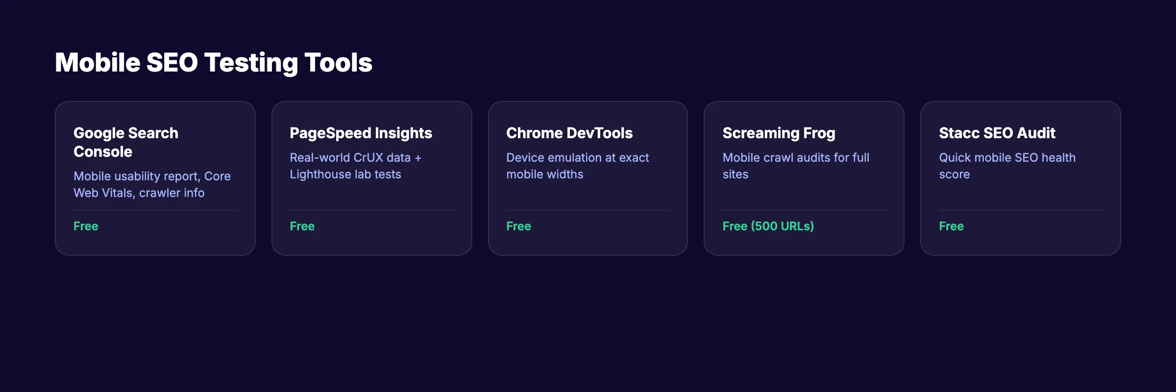
You cannot fix what you do not measure. These tools help you audit and monitor mobile SEO performance.
Google Search Console (Free)
Google Search Console is the primary tool for mobile SEO monitoring. Key reports: Mobile Usability, Core Web Vitals, Crawl Stats, and Page Indexing.
Google PageSpeed Insights (Free)
Enter any URL and get mobile performance scores based on real-world Chrome User Experience data. Focus on the “Mobile” tab. A score above 90 is good. Below 50 needs urgent attention.
Chrome DevTools Device Emulation
Test your site at common mobile widths: 375px (iPhone), 390px (iPhone 14), 412px (Pixel).
- Text readability without zooming
- All buttons and links tappable
- No horizontal scrolling
- Images properly sized
- Forms usable with thumb input
Third-Party Tools
| Tool | Best For | Cost |
|---|---|---|
| Screaming Frog | Mobile crawl audits | Free (500 URLs) |
| Ahrefs Site Audit | Mobile SEO issues at scale | Paid |
| Semrush Site Audit | Mobile usability + speed | Paid |
| GTmetrix | Detailed speed waterfall | Free tier |
| Stacc SEO Audit Tool | Quick mobile SEO score | Free |
Use the on-page SEO checker and website SEO score checker to verify individual pages. Run a full mobile SEO audit quarterly. Monitor Google Analytics 4 for mobile bounce rate monthly.
Common Mobile SEO Mistakes
These 8 mistakes appear on the majority of sites we audit. Each one hurts mobile rankings.
Mistake 1: Missing Viewport Meta Tag
Without the viewport tag, mobile browsers render pages at desktop width. The fix takes 5 seconds:
<meta name="viewport" content="width=device-width, initial-scale=1">Mistake 2: Blocking CSS or JavaScript
Some robots.txt configurations block CSS or JavaScript files from Googlebot. If Google cannot render your page, it cannot evaluate your mobile experience.
Mistake 3: Unplayable Video Content
Use HTML5 video with MP4 format. Add video schema markup so Google can surface your videos in mobile rich results.
Mistake 4: Redirect Chains on Mobile
Desktop pages that redirect to mobile-specific URLs sometimes create chains. Each redirect adds latency. Ensure every desktop URL redirects to its exact mobile counterpart (or use responsive design to avoid this entirely).
Mistake 5: Ignoring Mobile-Specific Keywords
Mobile users type shorter phrases and use voice search more often. They search “pizza near me” instead of “best pizza restaurants in downtown Chicago.” Optimize for conversational and location-based queries. Review search intent for mobile users separately.
Mistake 6: Oversized Images
A 2MB hero image loads in under 1 second on desktop fiber. On mobile 4G, it takes 8-10 seconds. Use the srcset attribute:
<img src="hero-768.webp"
     srcset="hero-400.webp 400w, hero-768.webp 768w, hero-1200.webp 1200w"
     sizes="(max-width: 768px) 100vw, 768px"
     alt="Mobile SEO optimization example">
Mistake 7: No Mobile XML Sitemap Consideration
Your XML sitemap should include all mobile-accessible URLs. For responsive sites, your existing sitemap covers both versions.
Mistake 8: Skipping Mobile Testing After Updates
Every CMS update, theme change, or plugin installation can break your mobile layout. Run a quick mobile test after every site change. Use your SEO audit checklist after every update. Check broken links and mobile rendering before marking any deployment as complete.
Mobile SEO Checklist (Complete)
Configuration:
- Viewport meta tag present on all pages
- Responsive design implemented
- No
user-scalable=noin viewport tag
Speed:
- Mobile PageSpeed Insights score above 50 (target 90+)
- LCP under 2.5 seconds
- INP under 200ms
- CLS under 0.1
- Images compressed to WebP format
- Critical CSS inlined, non-critical deferred
Content:
- Full content parity between mobile and desktop
- Same structured data on both versions
- Same meta tags on both versions
- All images include alt text
- No content hidden behind user interactions
UX:
- Tap targets at least 48x48 CSS pixels
- Base font size 16px minimum
- No intrusive interstitials
- No horizontal scrolling at any breakpoint
- Forms usable with mobile keyboards
Technical:
- CSS and JavaScript accessible to Googlebot
- No mobile redirect chains
- Mobile XML sitemap submitted to Search Console
- Mobile usability report shows zero errors
Let your content work while you optimize. Stacc publishes 30 blog posts per month so you can spend time on technical SEO. Every article is mobile-ready. Start for $1 →
FAQ
What is mobile SEO?
Mobile SEO is the process of optimizing your website for mobile devices. It includes responsive design, fast page speed, proper viewport configuration, touch-friendly navigation, and content parity between mobile and desktop. Google uses your mobile site as the primary version for indexing and ranking.
Does Google still use mobile-first indexing in 2026?
Yes. Google completed the switch to mobile-first indexing for all websites in July 2024. There are zero exceptions. Every site is now indexed and ranked based on its mobile version.
How do I check if my site is mobile-friendly?
Use Google Search Console’s Mobile Usability report, Google PageSpeed Insights, or Chrome DevTools device emulation. Search Console provides the most authoritative data because it shows what Googlebot actually encounters when crawling your pages.
What is a good mobile PageSpeed score?
Google considers 90-100 as good, 50-89 as needs improvement, and 0-49 as poor. Focus on Core Web Vitals thresholds (LCP under 2.5s, INP under 200ms, CLS under 0.1) rather than chasing a perfect 100 score.
Does mobile page speed affect desktop rankings?
Page speed is a ranking factor for both mobile and desktop results. But because Google uses mobile-first indexing, your mobile speed metrics carry more weight.
Should I create a separate mobile website?
No. Google recommends responsive web design. A separate mobile site creates duplicate content risk, splits link equity, and doubles maintenance. Responsive design serves the same HTML at the same URL and adapts with CSS.
Mobile SEO is not a separate discipline. It is the default state of SEO in 2026. Every optimization you make should start with the mobile experience and extend to desktop, not the other way around.
The sites that rank higher on Google treat mobile performance as a baseline requirement. Start with the checklist in this guide. Audit quarterly. Fix issues the same week you find them.
Related Tools & Resources
Free SEO Tools:
Best Lists:

Written by
Siddharth GangalSiddharth is the founder of theStacc and Arka360, and a graduate of IIT Mandi. He spent years watching great businesses lose organic traffic to competitors who simply published more. So he built a system to fix that. He writes about SEO, content at scale, and the tactics that actually move rankings.
30 SEO blog articles published every month
Keyword-optimized, scheduled, and live on your site. Automatically.
30-day trial · Cancel anytime
theStacc
Stop writing SEO content manually
30 blog articles, 30 GBP posts, and social media content. Published every month. Automatically.
Start Your $1 Trial$1 for 3 days · Cancel anytime